5G Analytics Demo
a demo that attracted 2 telecom customers to sign on for the MVP
Overview 💥
Company: Oracle, Communications Global Business Unit
Role: UX Designer
Status: 2 customers signed on, MVP version currently being developed
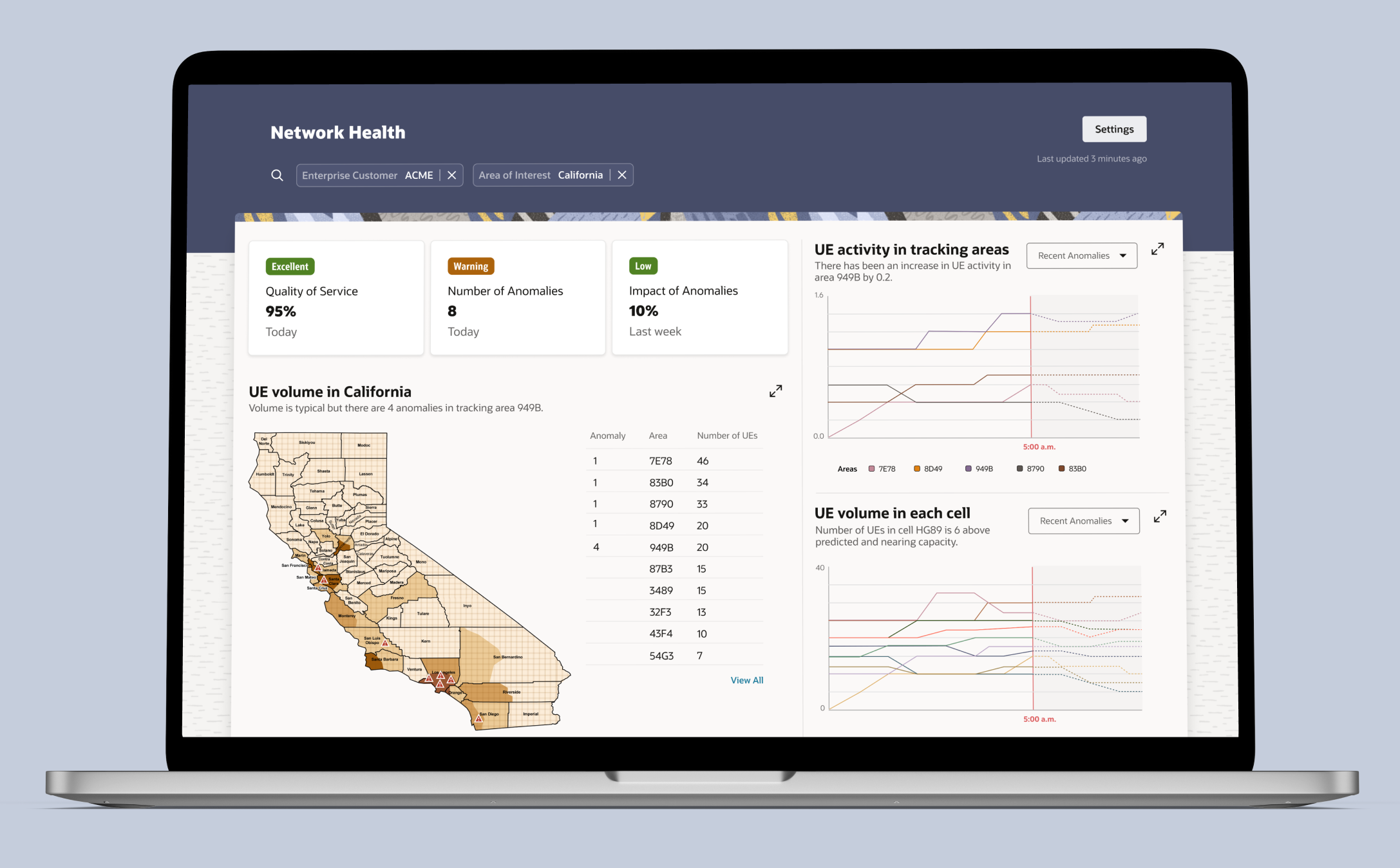
Summary: The 5G Analytics demo, NWDAF, provides analytics insights based on data collected. The analytics platform is a standard method used to collect data from user equipment (UE) and network functions from the 5G Core, Cloud, and Edge networks that can be used for analytics. This is a demo to gauge customers’ response to this platform and get them to sign on with Oracle for the MVP release so this demo will not have all screens and scenarios.
Discovery 🔎
Collaborated with a Researcher to hold interviews and workshops with internal stakeholders and end-users (like At&T, T-Mobile) to understand their needs.
Step 1 – Project Timeline
Tool: Figma
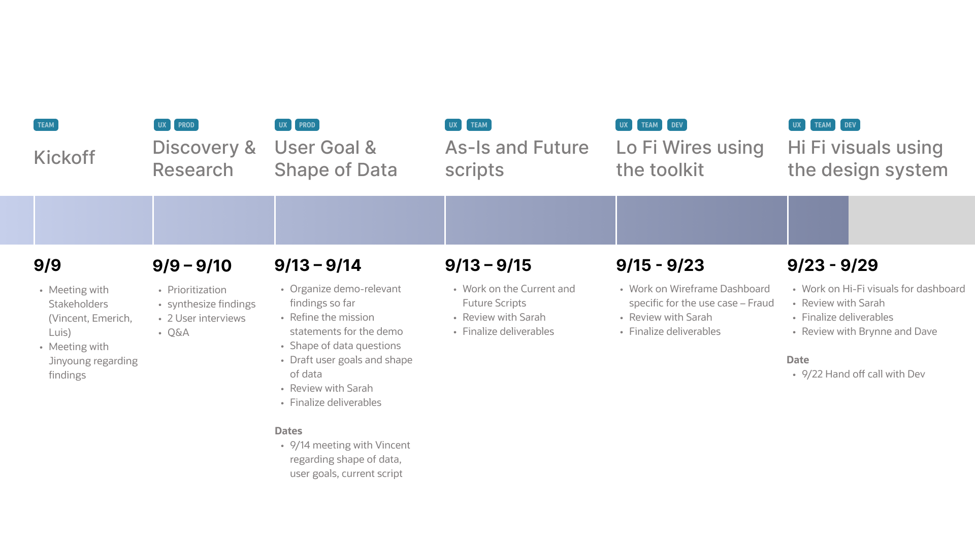
I created an interactive timeline for the Demo to ensure that I stay on track and deliver by the end of the five weeks. It allowed for transparency between me, the product manager, and the engineers.
Step 2 – Narrowing Down User
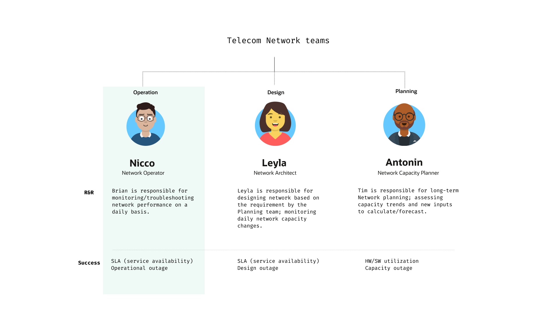
Based on the insight we gathered from the interviews and the stakeholders we decided on creating a demo specifically for the Network Operator. The demo was going to be presented to the different companies as a pitch for a NEW product so we decided that this specific user and scenario would be one thing that would differentiate our product from the other competitions. ,
Step 3 – User Goals
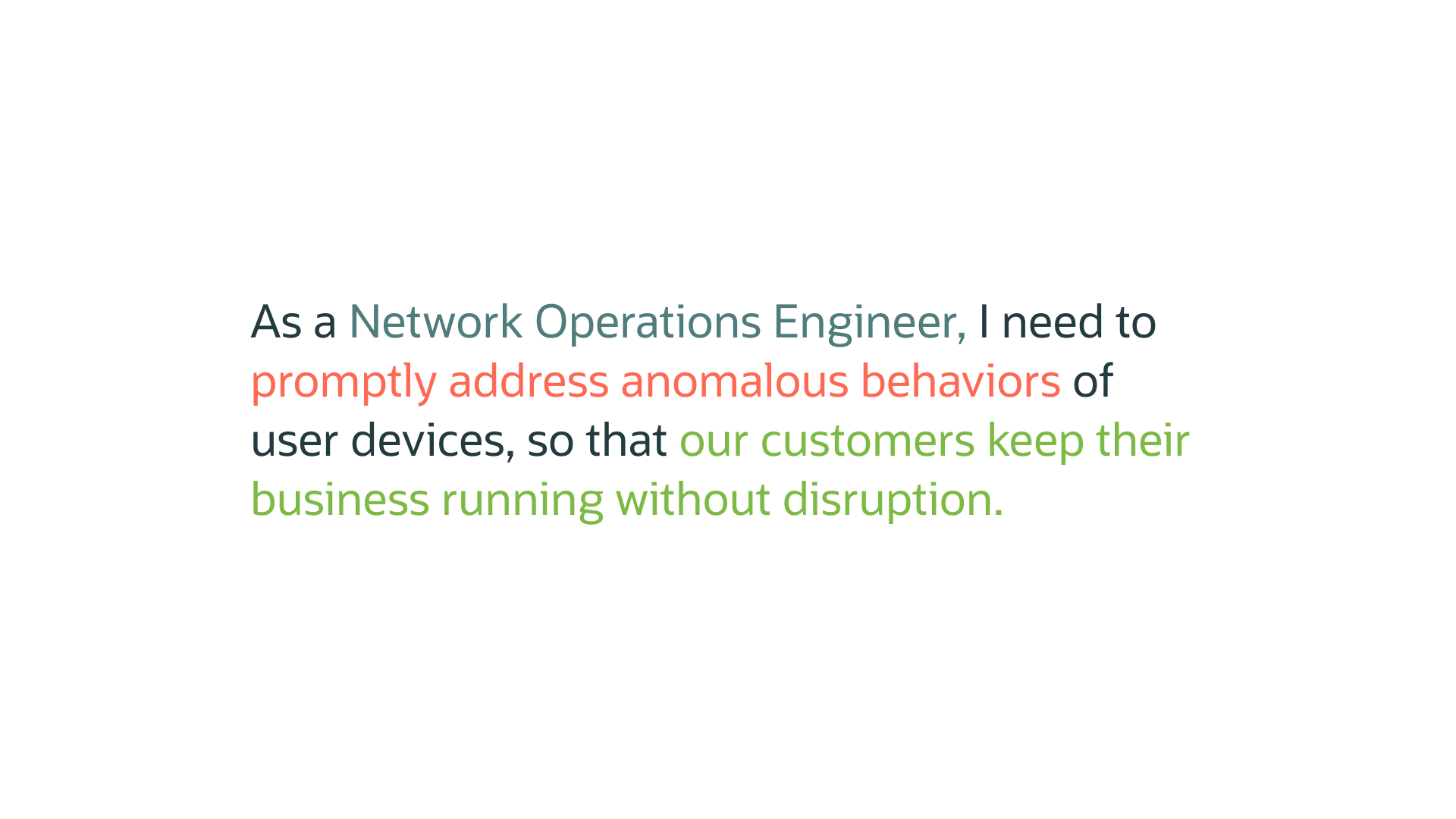
Based on the interviews conducted with Network Operators, I came up with their main goal and the motivation behind it.
Step 4 – Shape of Data
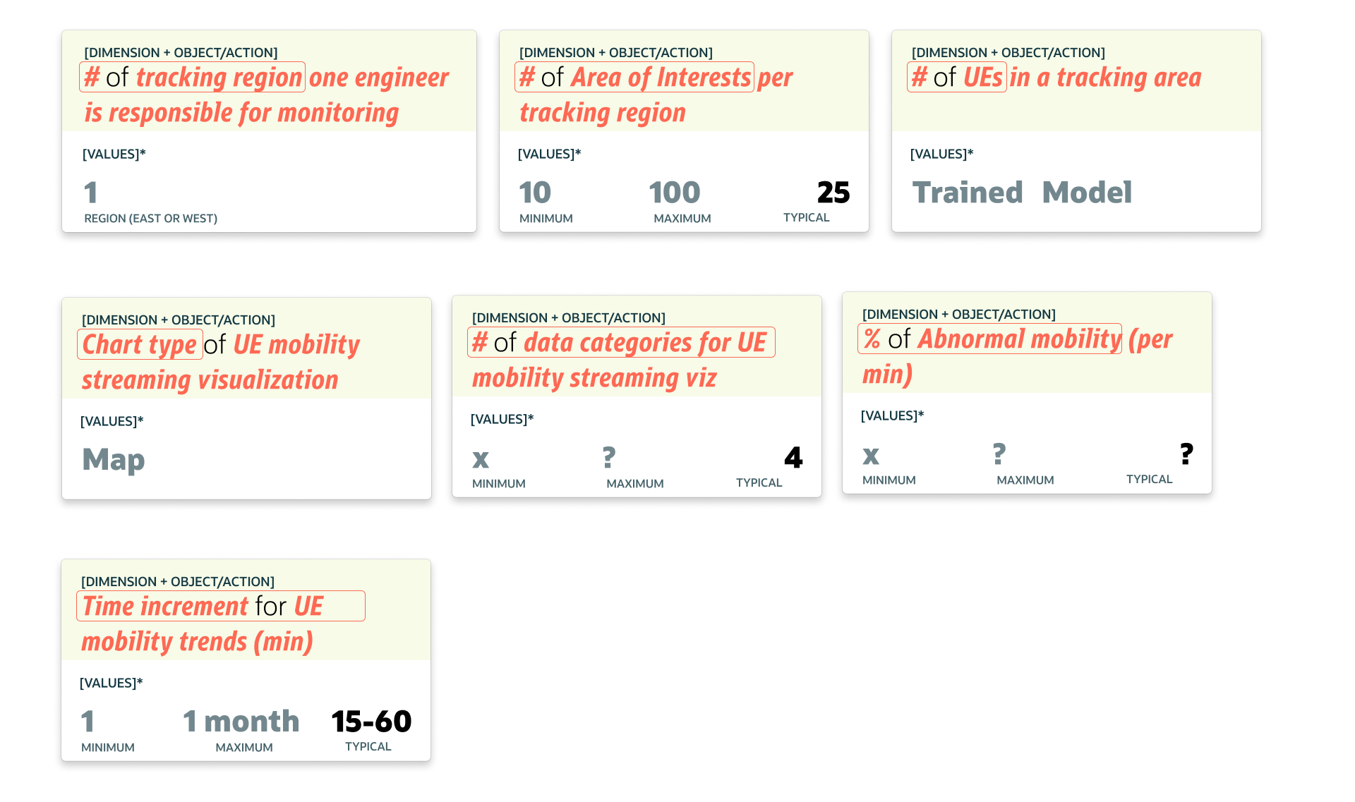
Collected data from the customer that would inform the visual design. This step is really crucial when it comes to layout and visual elements. It makes design decisions easier and more effective. Since this was a new product, and the demo was needed in 4 weeks, I wasn’t able to get much information. The internal stakeholders did not know the answers to most of the questions so I had to operate on assumptions.
Scripts 🎬
Step 1– Current Scripts
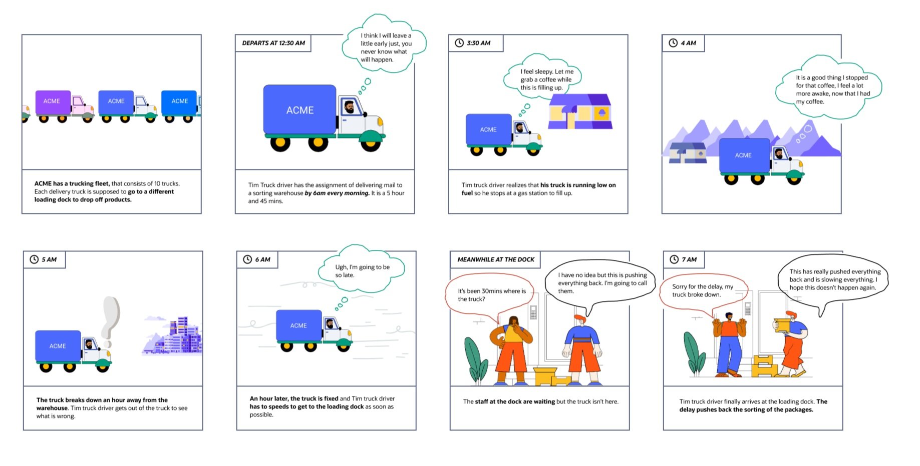
Based on workshops with customers and the product’s direction. I came up with a current scenario of trucks. Some of the main pain points were: having to account for truck drivers being sleepy and lack of communication which leads to delays in package deliveries at the docks.
Step 2 – Future Scripts
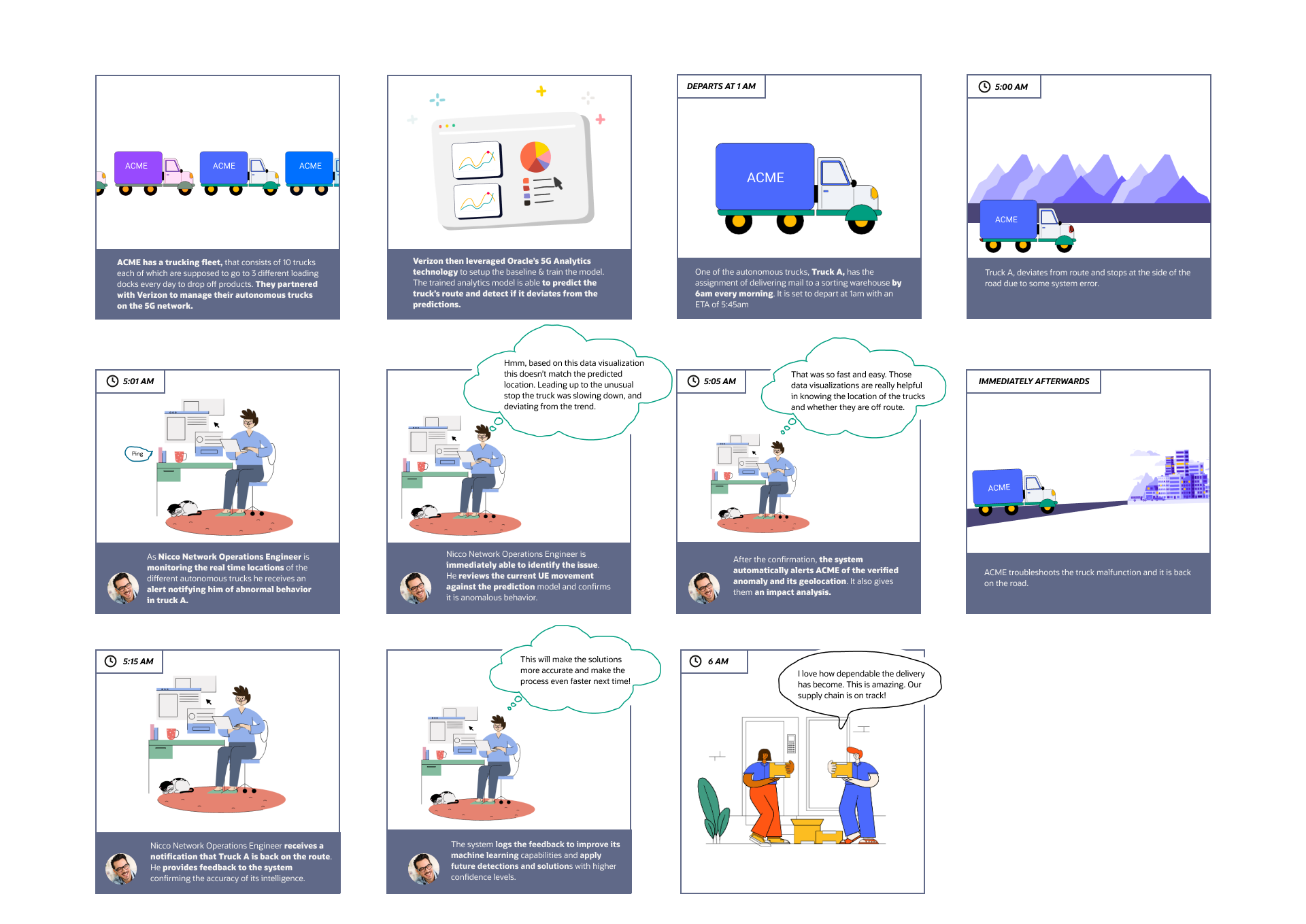
The future script incorporates the scenario of autonomous trucks that are monitored and tracked using 5G. This script incorporates the use of 5G analytics and how this can drastically improve communication, troubleshooting, and package delivery dependency. This script was presented to customers like At&T, Verizon, and T-Mobile. It was well-received by all the customers.
Wireframing 🚧
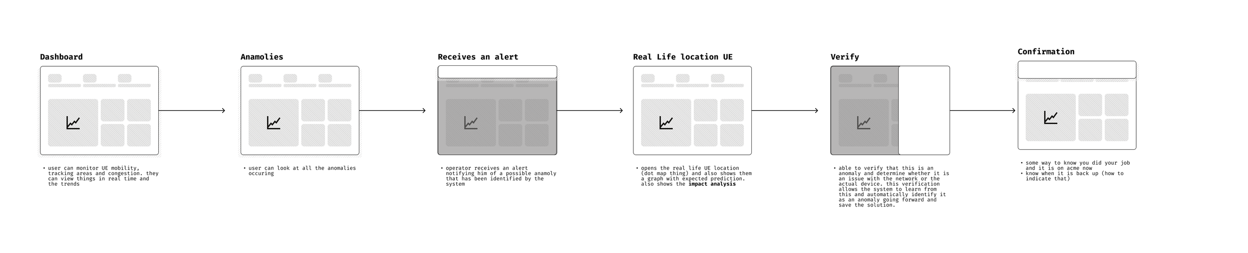
Step 1 – User flow
Tool: Figma
Created a user flow that set the foundation for the design. These user flows helped me determine navigation, roughly the number of screens, rough UI, and layout. I used it as a way to align with the internal team on the direction of the design.
Step 2 – Wires
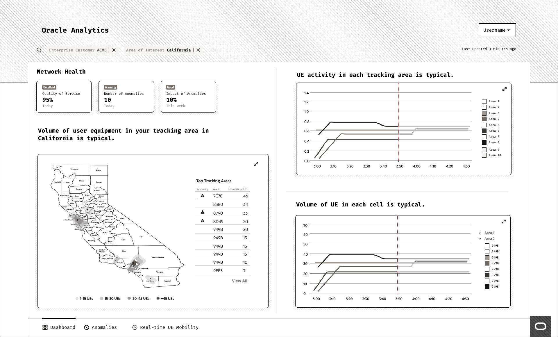
Main Dashboard page – highlights key metrics at the top to give the user an overview of the network. Allows the network operator to narrow down data through the search and filter option. Includes a map with the usage by location also highlights any anomalies (unusual activity). It gives a graph with the specific user equipment (UE) usage and the usage per tracking area. Both charts have a line that shows the real-time data and the predicted (to the right of the red line).

Notifications appear when there is an anomaly detected. It will appear at the top of any page on the application. The user can click into it at any time.
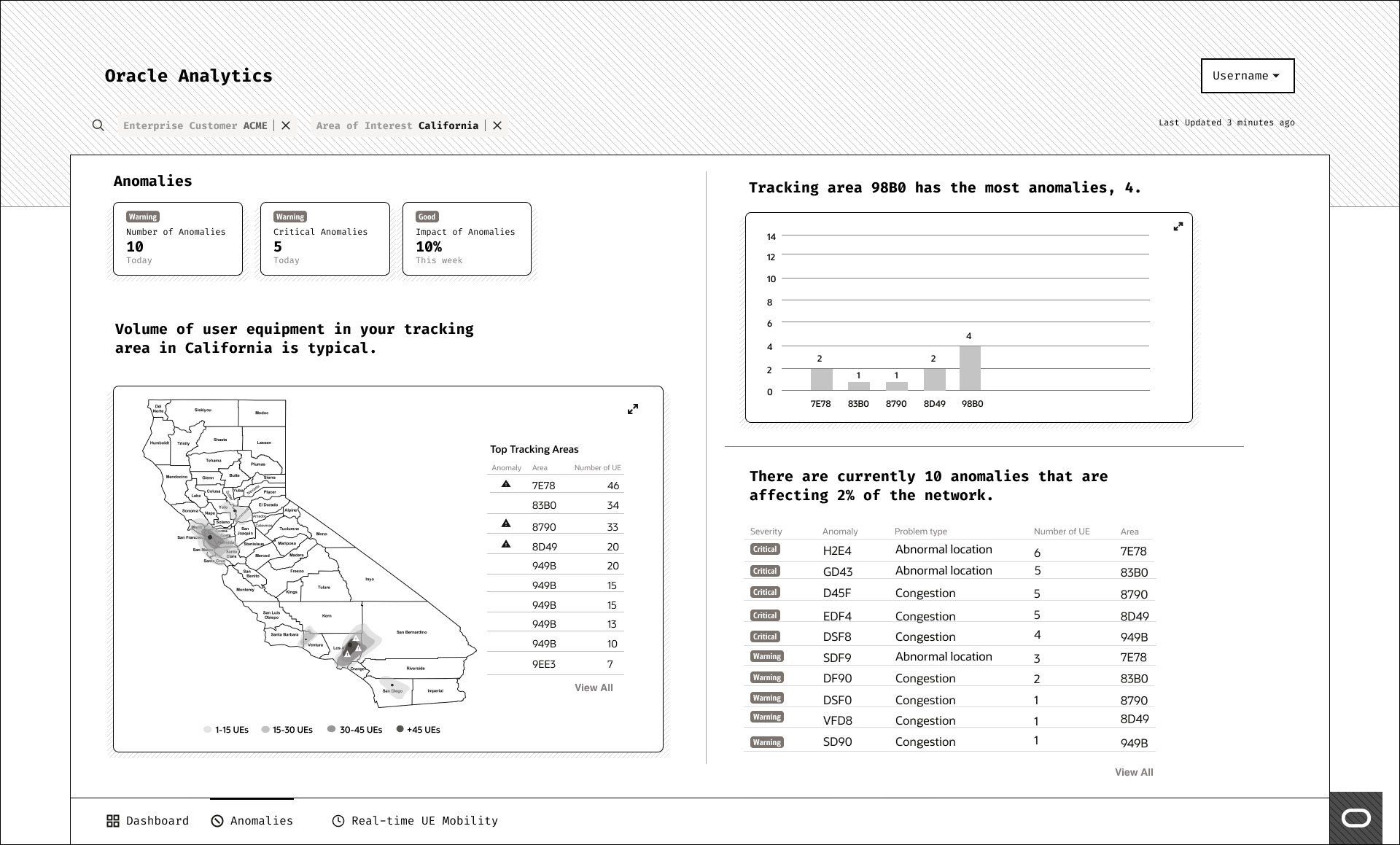
This is the anomalies dashboard (navigate to it using bottom navigation). It narrows down the list of anomalies occurring in the network, the impact it has, and the change over time.
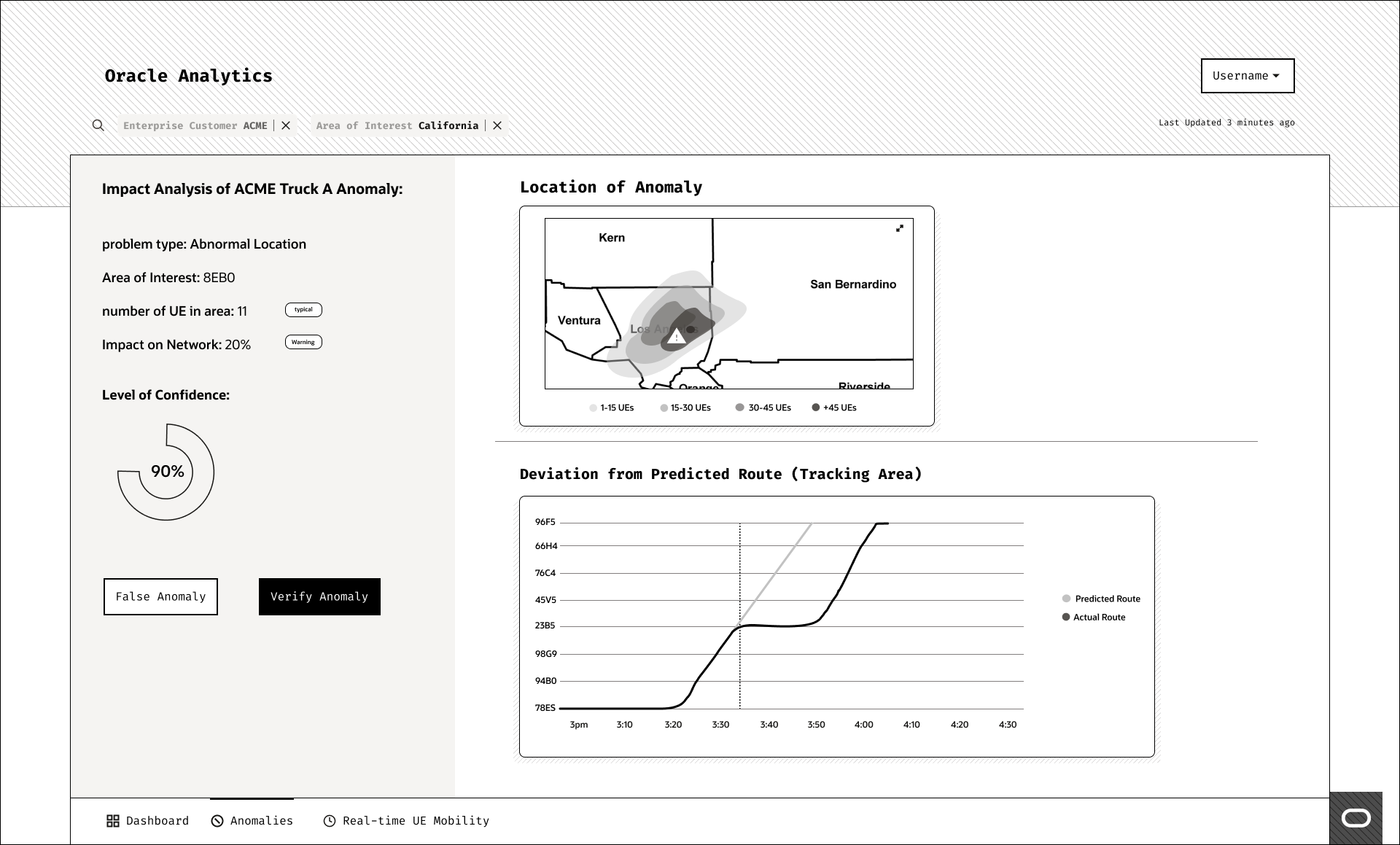
Specific Anamolies page – this page gives the network operator an overview of the anomaly, the information about the area that it’s affecting, and the device. It also shows the deviation from the predicted route. The operator can then either verify that this is an anomaly and send a report to the company in charge of the trucks or mark it as a false anomaly.
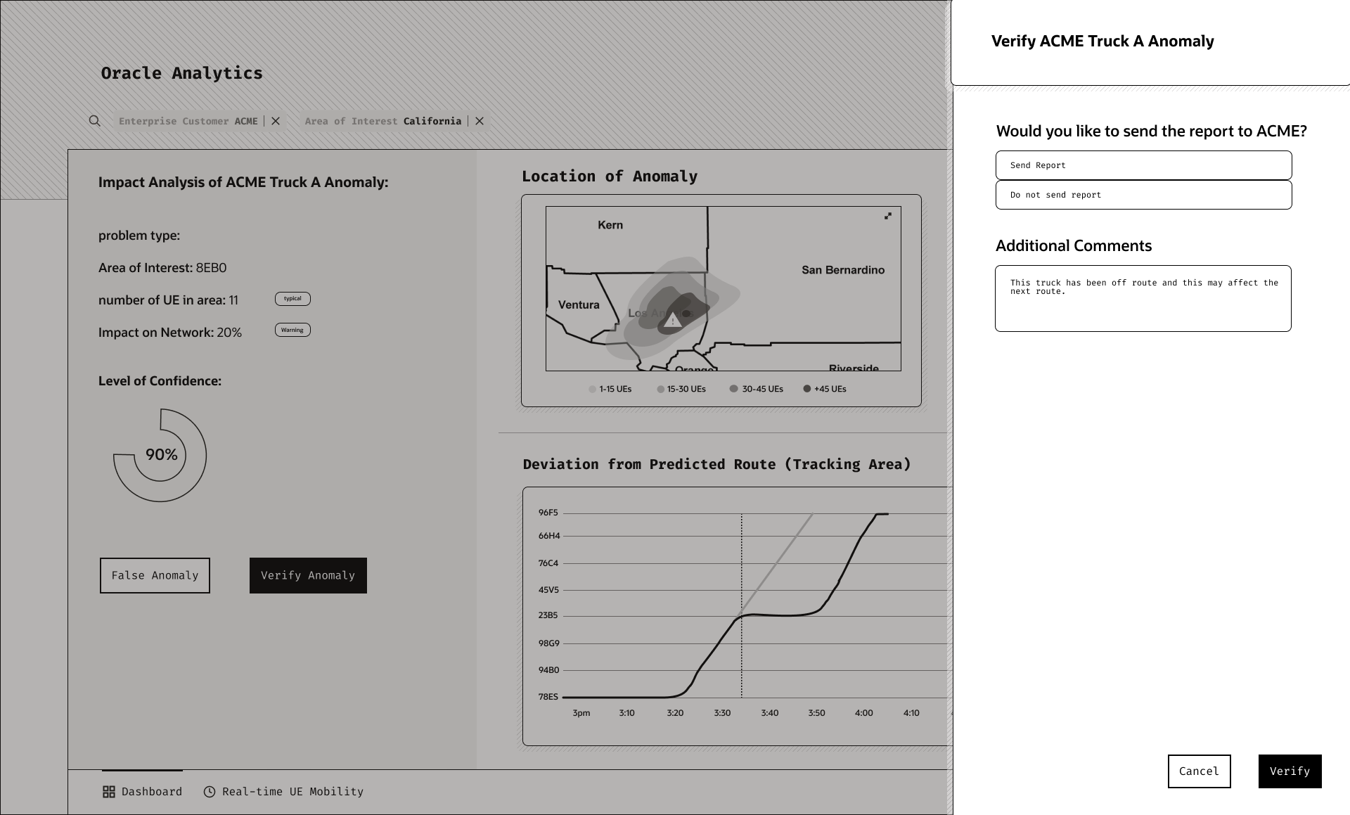
If they want to verify that this is an anomaly they have to option of sending this to the trucking company (ACME) so they can resolve the issue.
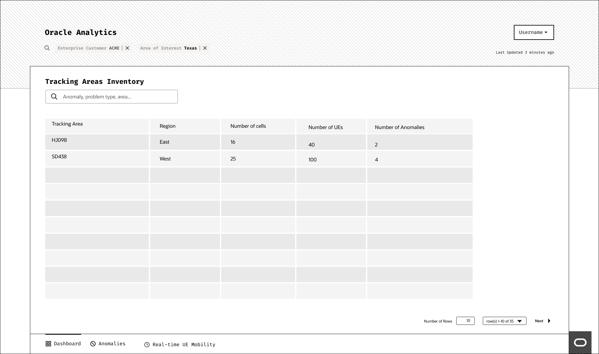
The operator can also look over the different tracking area, the number of anomalies within them, the region, and number of devices within the region.
Hi-Fidelity Design 🖥
Tools: Figma
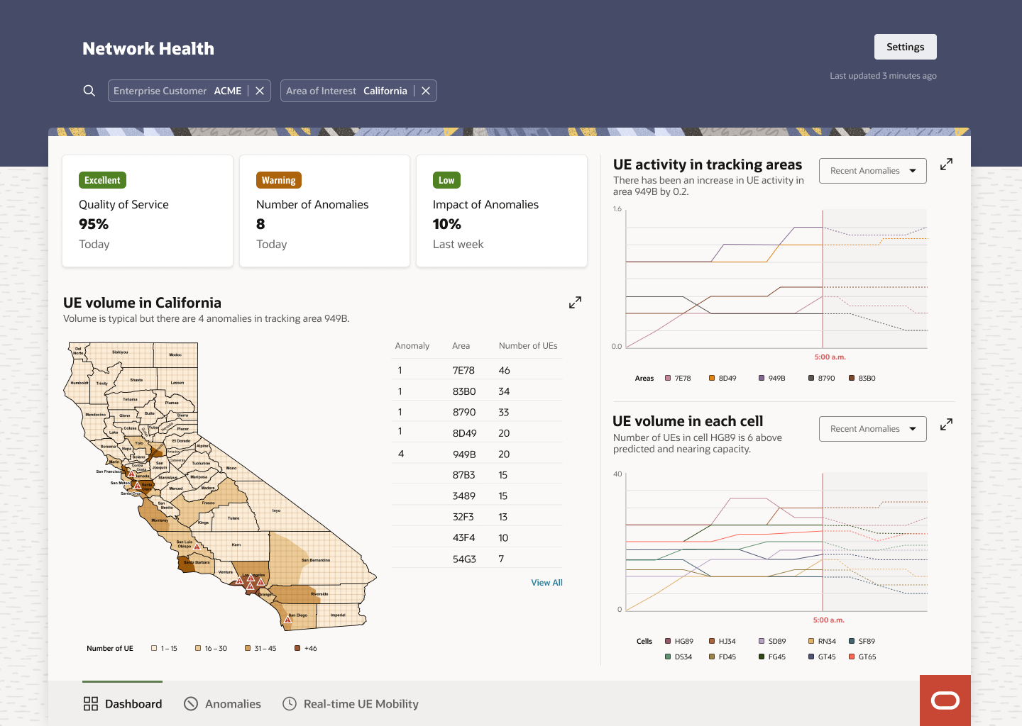
Main Dashboard page. Gives the network operator an overview of the network, network usage, and high level view of number of anomalies in a specific location.
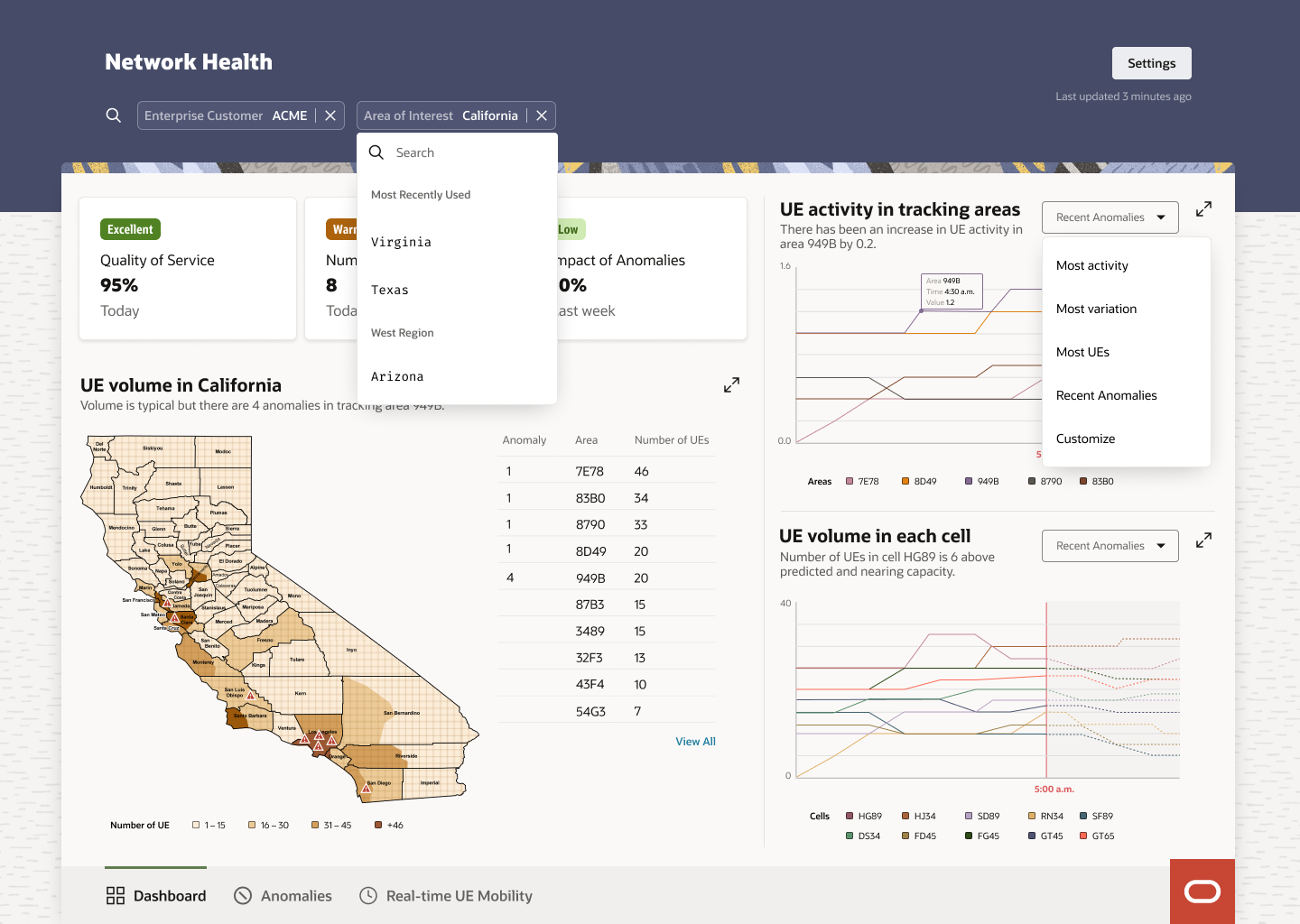
Dropdowns for the user to change and filter the data presented.
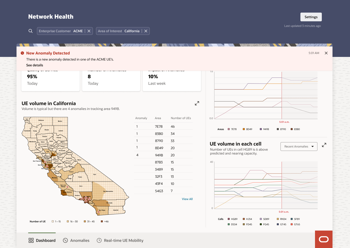
Alert / Notification appears at the top with information about the anomaly and allows them to navigate to the specific anomalies page.
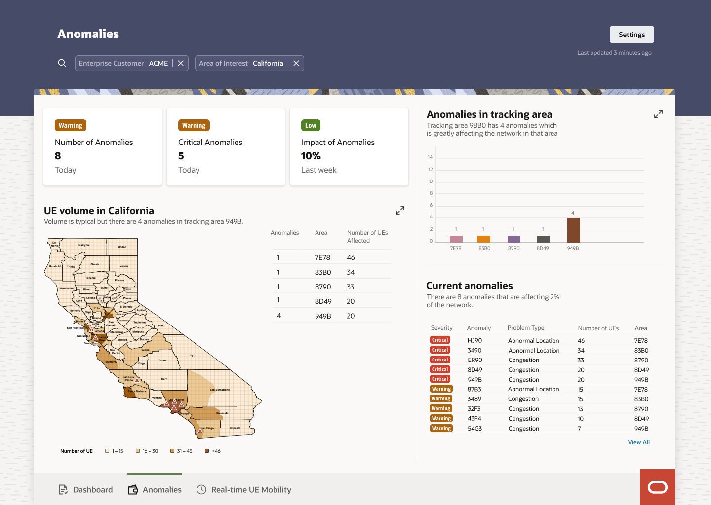
Anomalies dashboard gives the operator a more in-depth view into the anomalies and the impact they have on the network.
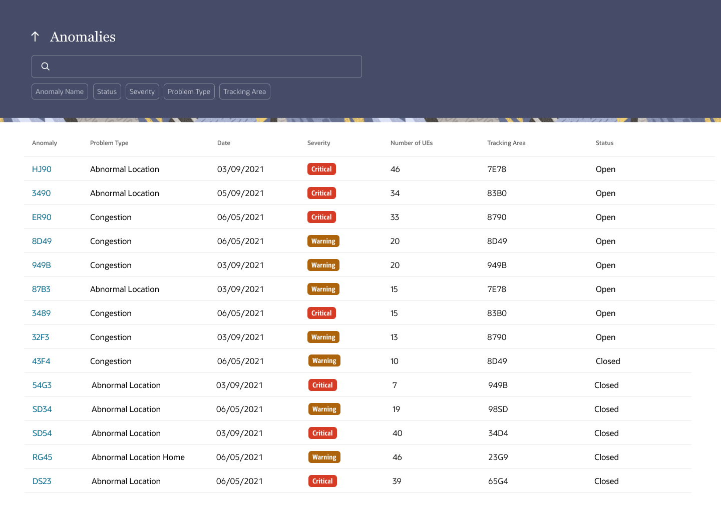
The anomalies inventory allows the network operator to view all past and present anomalies. They’ll have the ability to filter through them.
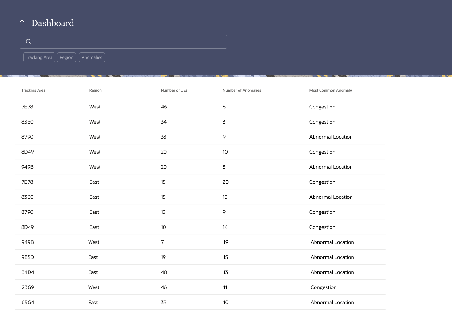
The Tracking area dashboard has all the tracking areas and high level information about each tracking area.
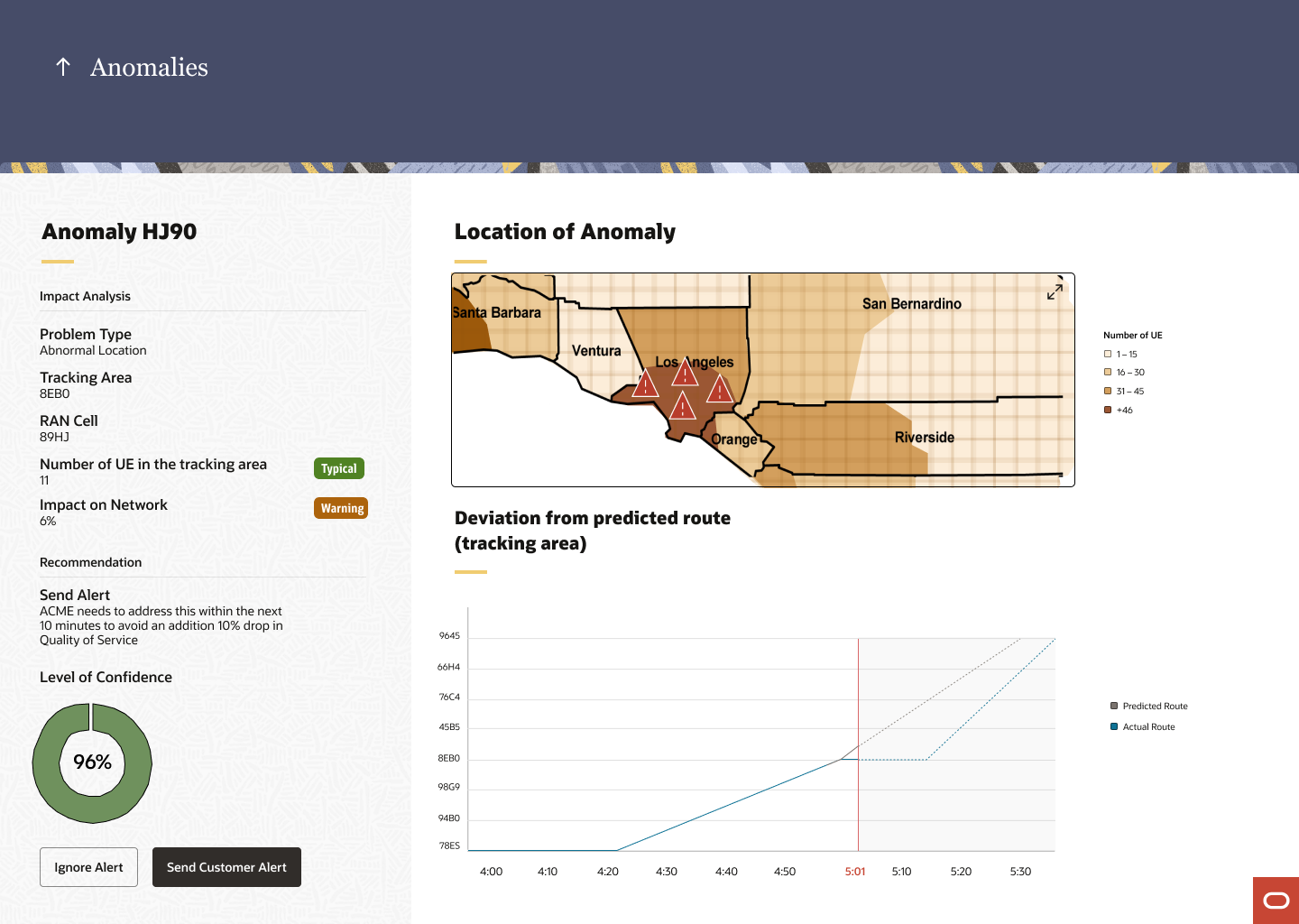
Specific anomaly drill down allows the user to see a single anomaly in more detail. It gives the user a recommendation, the impact, the location.
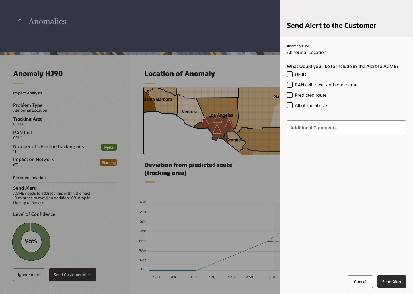
One of the actions is alerting the customer about the anomaly. A part of the information in the drawer will be auto-populated (reason for an anomaly). It will also allow the user to choose specific information to include in the alert to the customer.
Takeaways 📝
Working on a Demo…
Working on this 4 week demo was definitely a roller coaster. Starting this project I had no idea what 5G Analytics was, all I knew was that it was like 4G but faster - possibly. It took a lot of industry research for me to understand what it truly was. Working with the researcher definitely helped me make sense of the information I was getting from the stakeholders and the customers. There were a lot of things changing every day because the sales team was getting ready to pitch it to the customers. So in order to stay on track, I had to schedule 4 weekly touchpoints to sync with the product, sales, and engineering team - some were status updates via slack while others were meetings to get feedback. I didn’t have time to complete specs for the engineers so I had 3 Design Q&A sessions with the engineering team to give them feedback on the pages they were developing.
Overall, this project really taught me how to adapt and the importance of transparency between designers and other teams involved.