BRIDGEGOOD Inclusion
a simple interactive resource to help creatives understand and implement inclusivity
Check out the live website (BRIDGEGOOD.com/inclusion)
Overview 💥
Company: BRIDGEGOOD – a nonprofit organization that is committed to helping creatives from minority backgrounds succeed in the tech and design industry.
Role: Team Lead, UX Designer, Illustrator
Status: Live on BRIDGEGOOD.com/inclusion
Summary: The BRIDGEGOOD Inclusion feature has simple yet impactful information to help creatives understand and implement inclusivity and accessibility into their designs and everyday life.


Discovery 🔎
Conducted user research to identify what the students need, what struggles they face finding information about inclusive and accessible design, and how much they know about it.
Problem Statement
BRIDGEGOOD needs a way to ensure the organization is helping mold conscious and empathic designers. BRIDGEGOOD users need an engaging resource to reference concerning salient topics in the creative community and the creative workspace.
Solution
Create a BRIDGEGOOD feature that emphasizes the importance of inclusivity and related concepts within the design and tech world. This feature will allow creatives to learn about inclusivity, encourage them to create inclusive design, and engage in meaningful conversations.
Step 1 – “How might we…”
Tool: Miro
After interviewing our users, talking to the product manager, Shaun, and the Program Manager, Yudy, and taking a closer look at the BRIDGEGOOD mission, I was able to identify pain points and pleasure points. I then used the knowledge from that to come up with “How might we… ” statements and voted on them to identify the most important themes and HMWs to tackle:

Step 2 – Define
Tool: Miro
We then combined our ideas and narrowed them down to a couple of features we thought were important. We also brainstormed some names for the new inclusion feature.

Step 3 – Storyboard and Persona
Tool: Miro, Pen and Paper
After deciding on the direction we decided to create a storyboard for the users both BRIDGEGOOD creatives and non-BRIDGEGOOD creatives. Our audience would be creatives that are looking to learn more about inclusivity and how to implement it into their work and everyday lives.

New Creative

Returning BRIDGEGOOD Creative
Wireframing 🚧
Created several different iterations of the wireframes and conducted a heuristic and cognitive evaluation with designers and end-users (students).
Step 1 – Lo-fi/ Mid-fi Prototype
Tool: Miro and Adobe XD
We then combined our ideas and narrowed them down to a couple of features we thought were important. We also brainstormed some names for the new inclusion feature.


Step 2 – User Testing
Tools: Zoom and Miro
We received feedback from Slack designers and the product manager regarding hierarchy and navigation. We reduced the number of tabs and decided to go with a sticky side navigation bar.
We also conducted 5 user testings via zoom. We held 30-minute user testings of our prototype on 5 BRIDGEGOOD creatives via Zoom. During the session, we took notes on their pain points, places of improvement, and their pleasure points. We then sorted them out in order of priority.
Takeaway: Main concerns that we addressed were regarding navigation, naming convention, and narrowing down the focus.

Hi-Fidelity Design 🖥
Compiled a design system, created assets, wrote content, created the visual design, and conducted user testing.
Step 1 – Design System
Tools: Adobe XD, Google Chrome Inspect tool
What: To create a faster workflow for this New Feature development and to familiarize ourselves with the Brand Guidelines, we made a design system guide. We used this guide throughout this design sprint and the feature redesign sprint.
How: To help us identify the commonly used assets we used Google Chrome’s inspect tool. After gathering all of the information that we needed, we organized the design system on Adobe XD in a way that we felt would best benefit us.
My Role: I came up with the legend and naming convention to make it easier to find the assets. I also found and organized all the logos, icons, text buttons, and illustrations in the components section.

Step 2 – Creating Assets
Tool: Adobe Illustrator
I created the illustrations on adobe illustrator using the single-line technique and different colors from the BRIDGEGOOD design system that we previously created. We chose this specific technique because it is unconventional and rarely seen on websites. These can be found throughout the different pages of the feature.

Step 3 – Content Writing
Tool: Google Doc
Together we collaborated on coming up with concise and intriguing content that will make the viewer interested in learning more and creating inclusive and accessible design. We had to make sure that the descriptions for the Abc cards did not exceed 200 characters and that the paragraphs did not have a big difference in length. Having all the text on a google document makes it easier for the engineer, Trung, to build the feature.
Step 4 – Visual Design
Tool: Adobe XD
After receiving feedback from Slack designers and the product manager regarding hierarchy and navigation. We reduced the number of tabs and decided to go with a sticky side navigation bar.
Together we collaborated in creating the layout for the web version of the BRIDGEGOOD Inclusion feature. I split up the pages and delegated tasks in order to get the prototype done in time. We used the design system we previously created to design the prototype on Adobe XD efficiently and following the BRIDGEGOOD brand.
Step 5 – Another User Testing
Tools: Zoom and Miro
We decided to conduct another round of user testing to make sure our feature was more user friendly and accessible. We did 30-minute user testings on 4 more individuals both BG creatives and non-BG users. During the session, we took notes on their pain points, places of improvement, and their pleasure points.
Takeaway: One of the main points that different users repeated was that the text was too wordy and hard to read so that was one of the main things we worked on after the user testing. We made the text more concise and added catchy phrases and titles to draw the reader’s attention.

Final Design ⚡️
Tools: Adobe XD and Adobe Premiere Pro
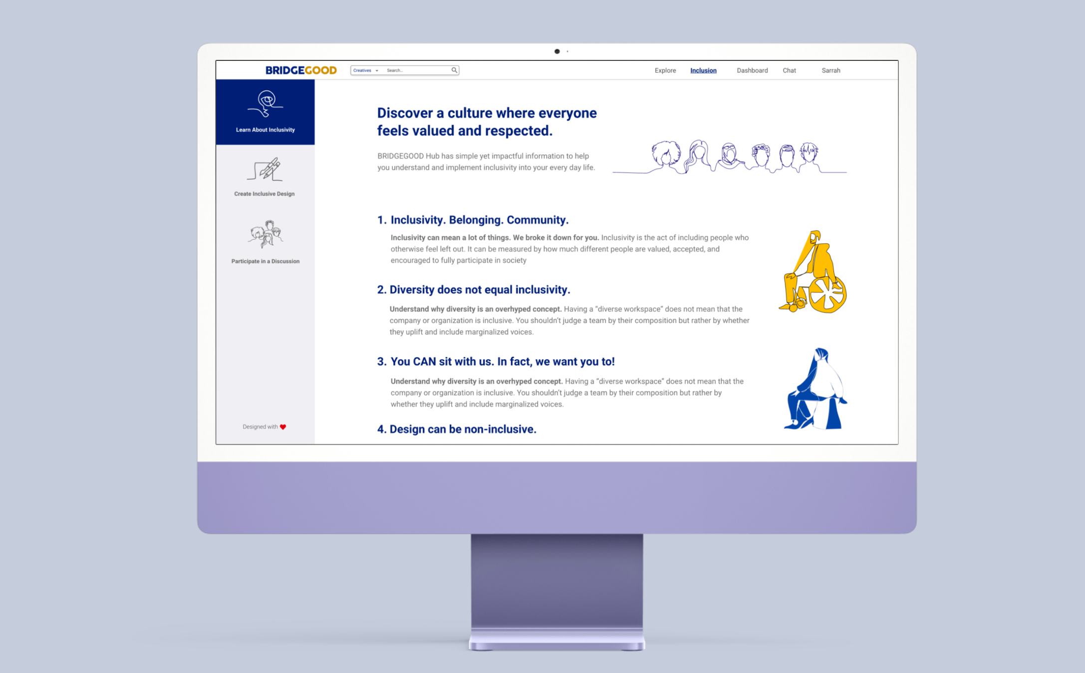
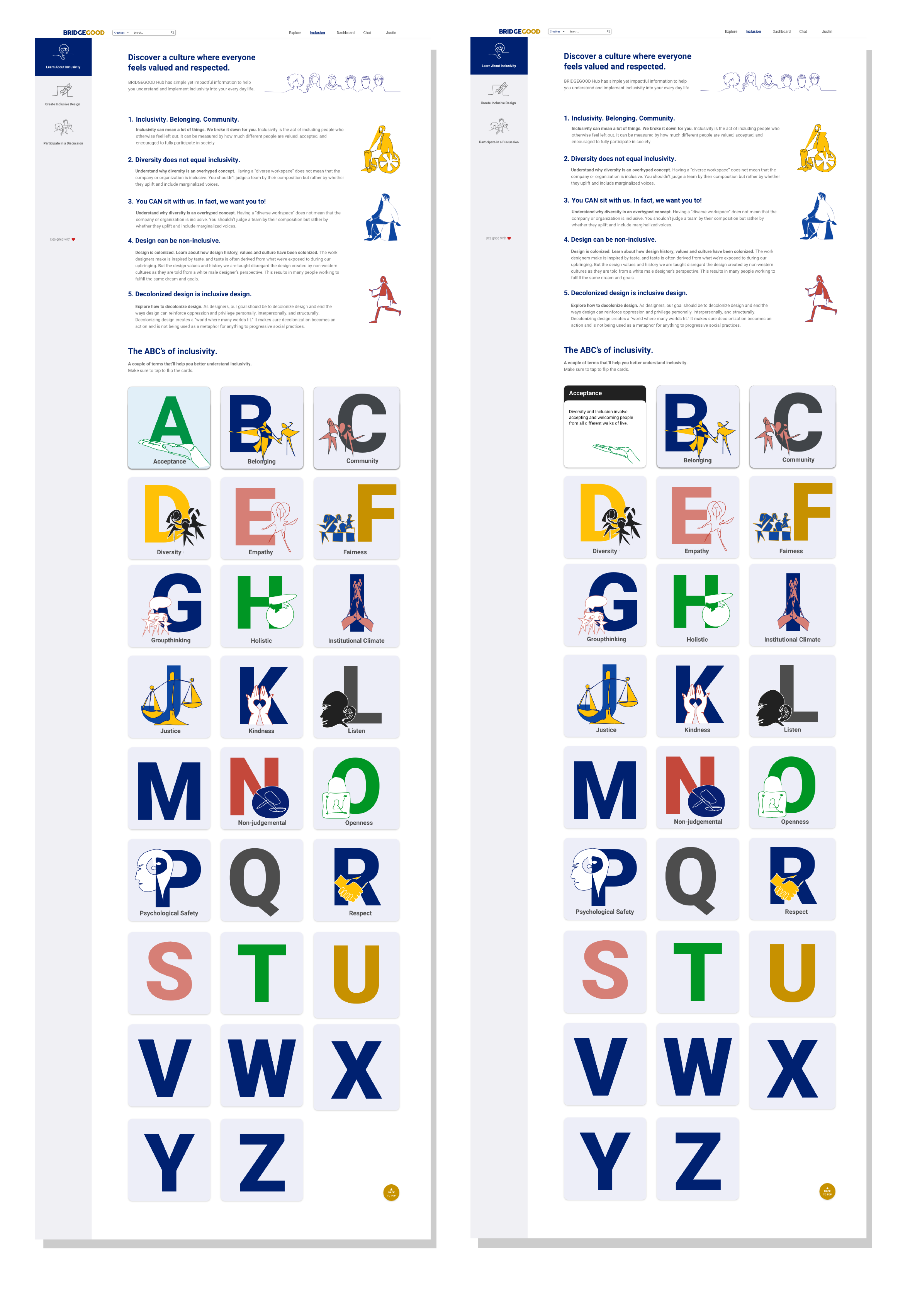
Page 1 – Learn about inclusivity
The first page of the feature is the “Learn about inclusion.” It is a fun and interactive way to learn about inclusivity and its importance. The text on the page is short and concise broken up by colorful illustrations. The bottom section is the “ABC’s of Inclusion,” it has words that define what inclusivity is and how to practice it. By hovering over the Letter the card will turn revealing the definition (see picture on the right).
Page 2 – Create Inclusive Design
This page focuses on introducing ways to practice inclusive and accessible design. It features resources, tips, and a quiz. The quiz is a fun way for users to test their knowledge and see if they know the difference between accessible design and non-accessible. Users can click and choose the answer they think is correct. If it is right a green checkmark will appear with the word “correct” (see picture on the right). If the answer is incorrect then a red X will appear with an explanation. Users can take the quiz as many times as they would like.

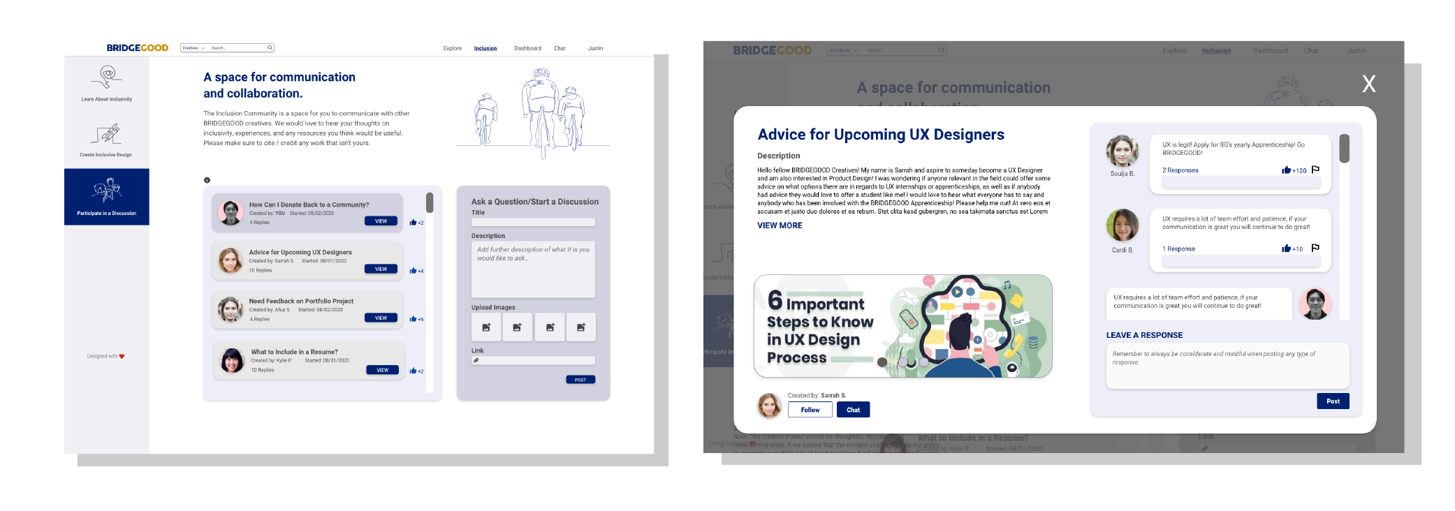
Page 3 – Participate in a Discussion
This page is in the format of a forum. It allows BRIDGEGOOD creatives to communicate and collaborate with each other. This space allows users to share their thoughts and experiences with inclusivity and any helpful resources they have. Users can start their own discussions or contribute to existing discussions. BG Creatives will also be able to view fellow creative’s portfolios and follow them. Non-BRIDGEGOOD users will not be able to contribute to the discussions but they can view all the threads.
Prototype Walkthrough 🔛
Here’s a full walk-through of the prototype from start to end.
Takeaways 📝
Working within a team…
My teammates each came from a different background and were experts in different fields. Afua came from a psychology background while Justin has a graphics and traditional art background. While I come from a digital design background. Having everyone’s input tremendously improved our prototype. Without my teammates, this feature wouldn’t have been as detailed and cohesive as it is now. We worked together and helped each other out whenever someone was stuck. Together we were able to create a much-needed feature for the BRIDGEGOOD website (BRIDGEGOOD.com/inclusion) that exemplified what BRIDGEGOOD stands for and re-emphasized its mission. All of this while using the design system which helped us stick to the BRIDGEGOOD brand guidelines.
Working with an engineer…
As a team lead, I communicated with the engineer, Trung. Throughout the process of building the feature, Trung would reach out to me with questions and concerns regarding our design. I learned that when projects are actually coded there is a lot more thought and restriction that goes into bringing the design to life. One of the things that I did not realize is that the designs do not necessarily turn out the same way that we envisioned. The “ABC’s of Inclusions” portion was a little more complicated than we initially thought. Trung told me that all the illustrations have to be the same ratio so that they fit properly in the boxes. Overall, my experience working with Trung taught me a lot about what happens after a design is made. I learned the having a google document with text and video walk-throughs are very helpful and images are better as svgs.
Here is the final shipped product: BRIDGEGOOD.com/inclusion