Utilities Meter Investigator
a platform that uncovers the mysteries surrounding incorrect electric and water meter billings
Overview 💥
Company: Oracle, Energy and Water Global Business Unit
Role: UX Designer
Team: Myself and another designer
Status: In Development
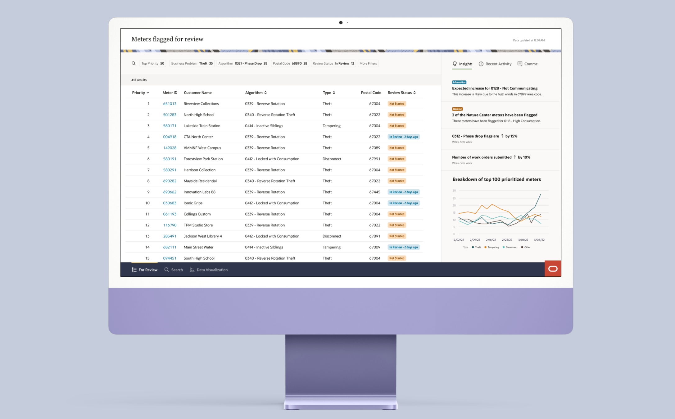
Summary: The Utilities Meter Investigator aggregates the data of the meters and analyzes it so that the analyst is presented with the different problems, the impact, and the recommended action. This project is a redesign of the legacy version.
Discovery 🔎
Interviewed the customer delivery team and the product owners regarding the existing application, their vision, and problems the customers are having. This helped me determine the best way to proceed.
Step 1 – Project Timeline
Tool: Figma
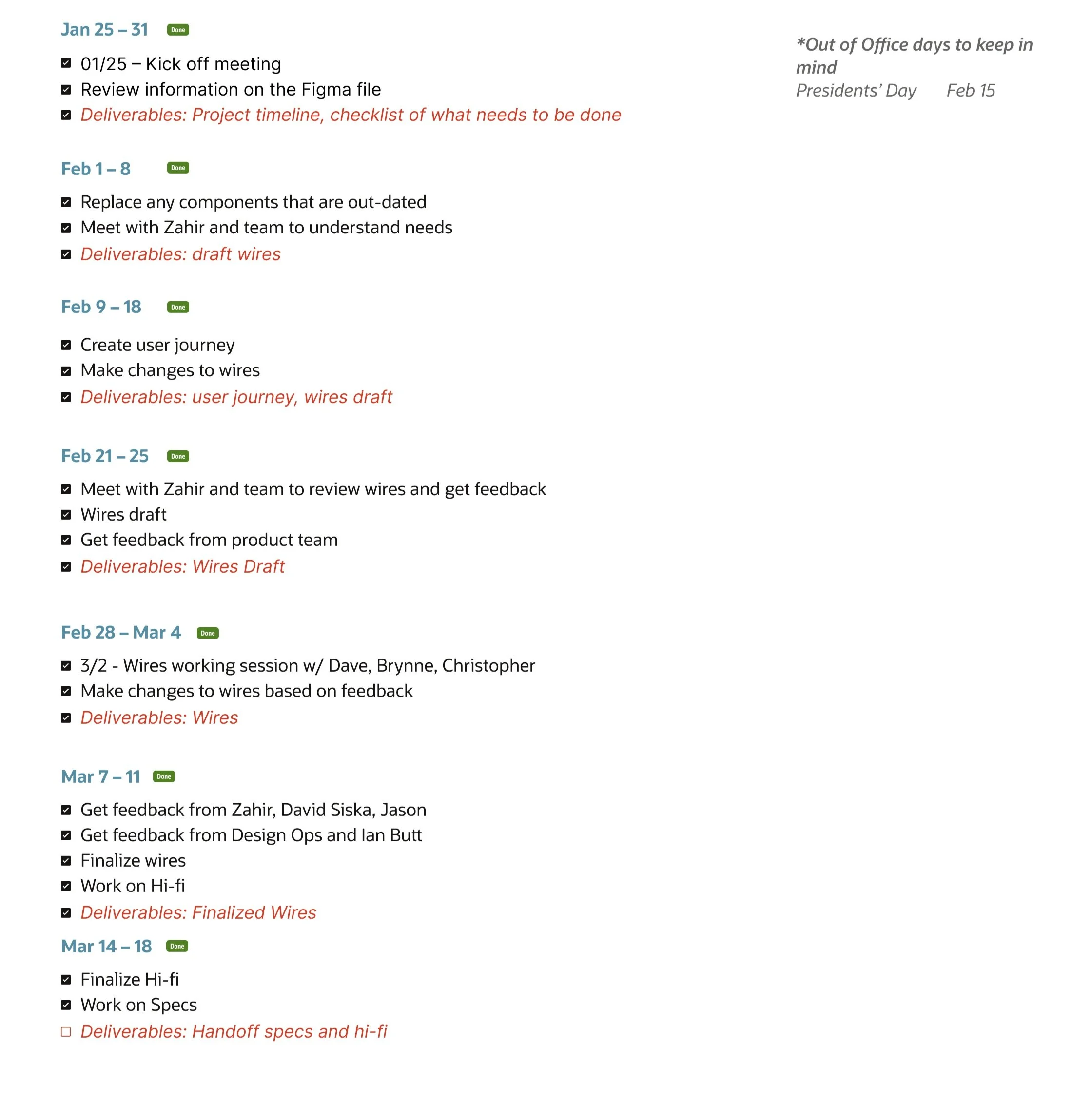
I created an interactive timeline for the project to ensure that I stay on track and be transparent with the product owner and engineers on deliverables and timeline updates.
Step 2 – Defining Roles
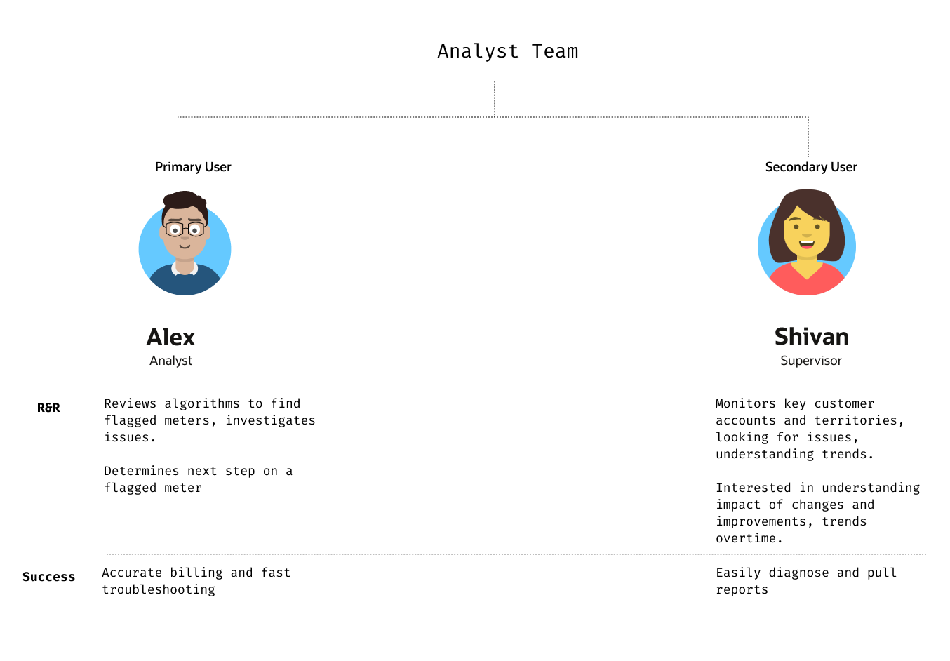
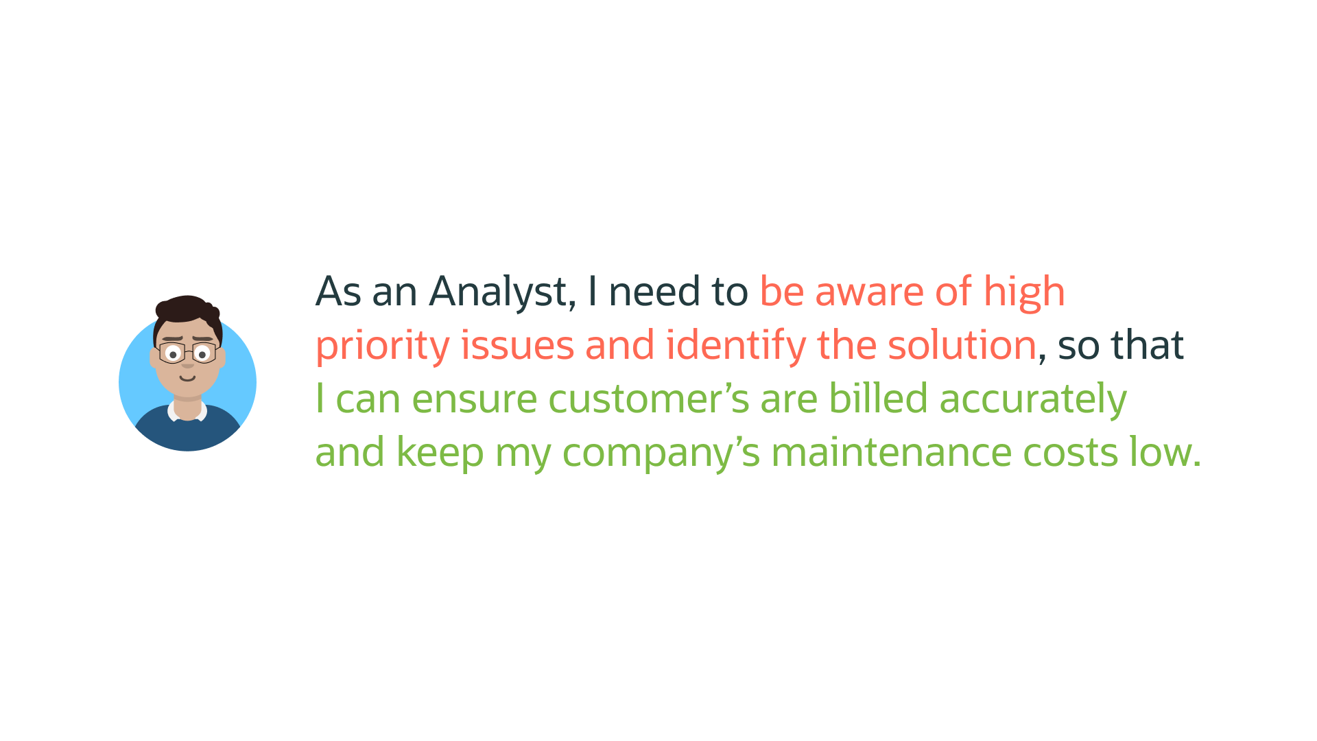
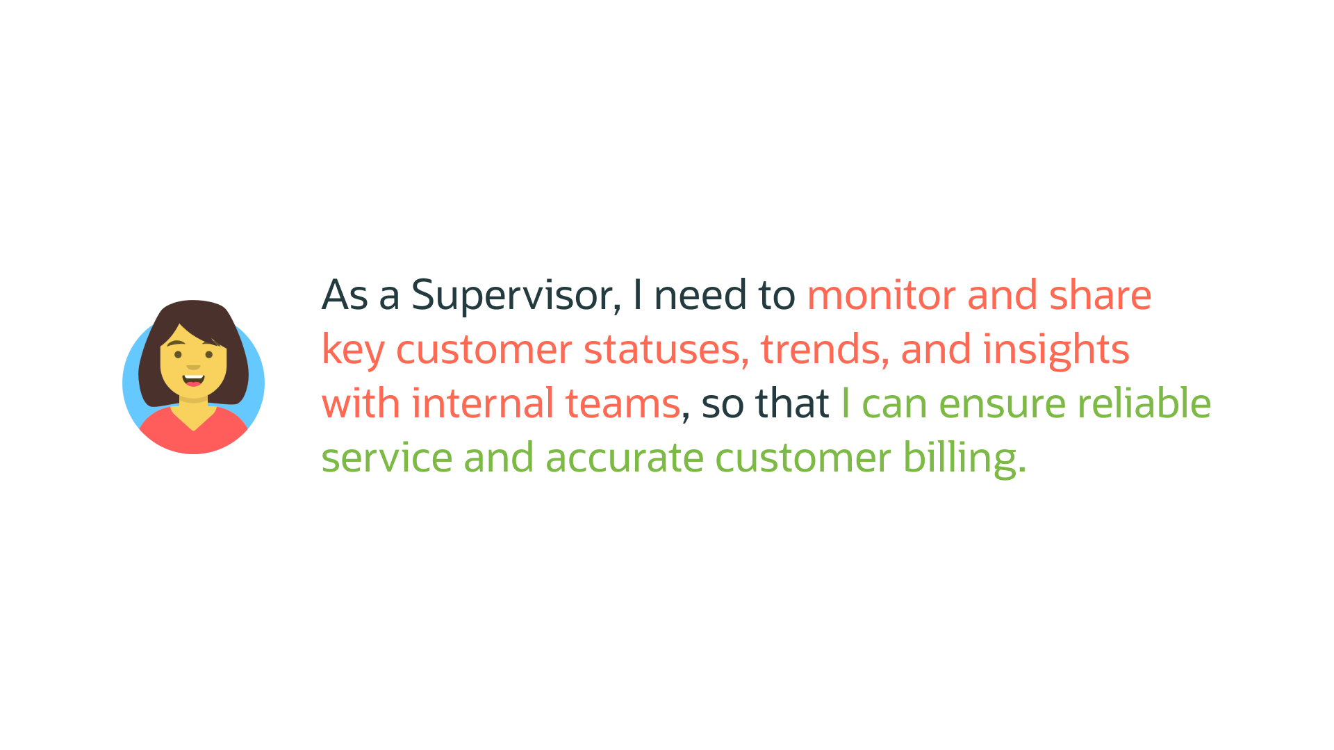
Based on the interviews conducted with the customer delivery team and the product owner to understand the two roles, Analyst and Supervisor. Defining their roles helped me understand their needs and usage.
Step 3 – User Goals
Based on their roles I was able to clearly define their goals and the motivations behind the goals.
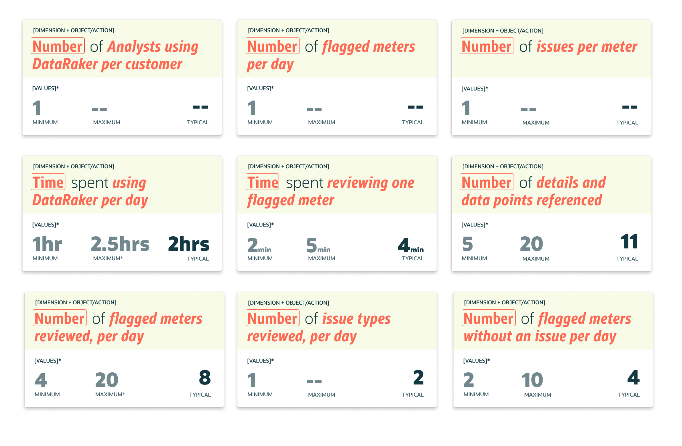
Step 4 – Shape of Data
Collecting the data really helped inform my design decisions and further understand their interaction with the platform. The data I gathered was from the customer service team because I didn’t have access to end-users.
Scripts 🎬
Step 1– Current Scripts
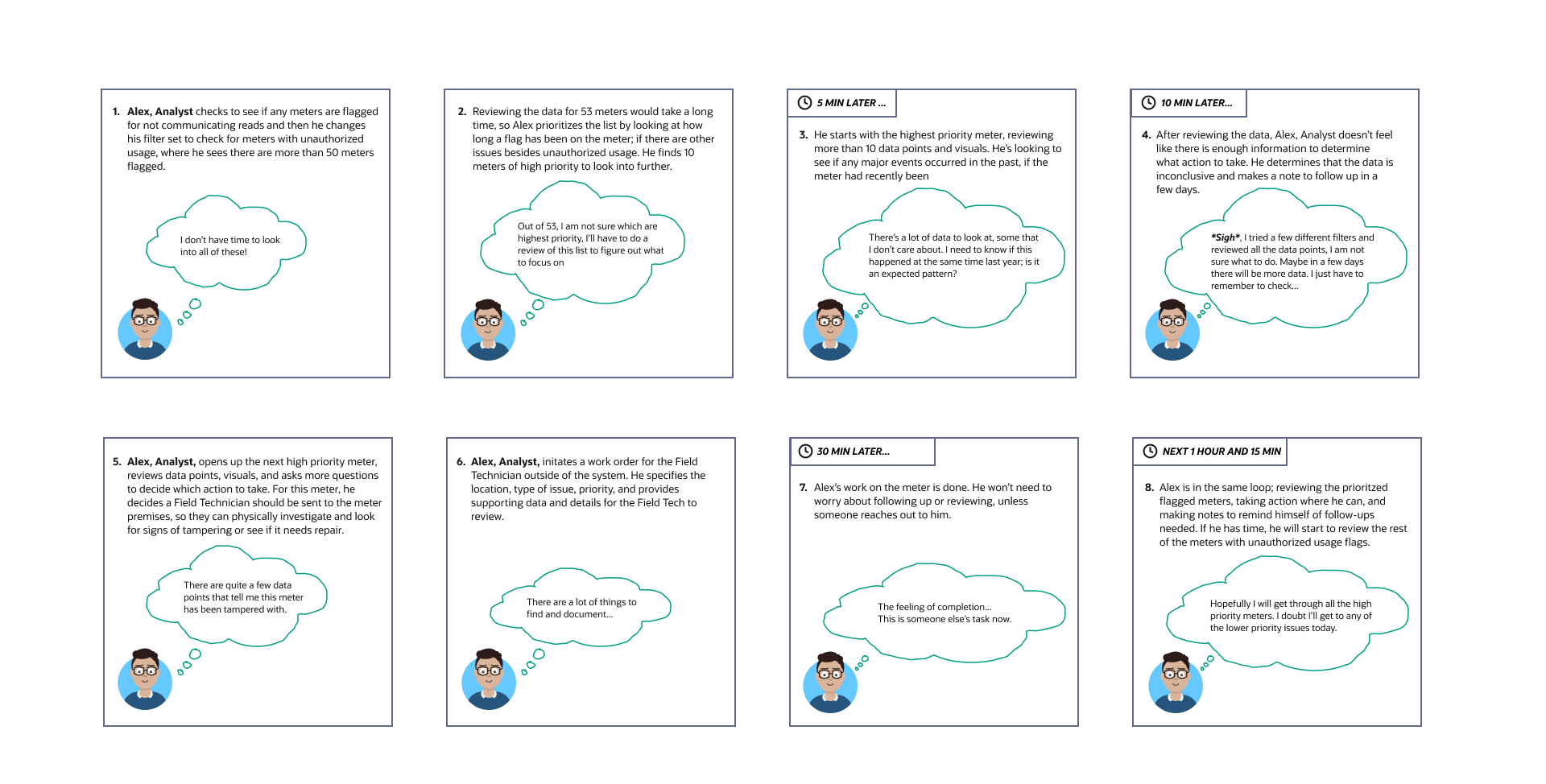
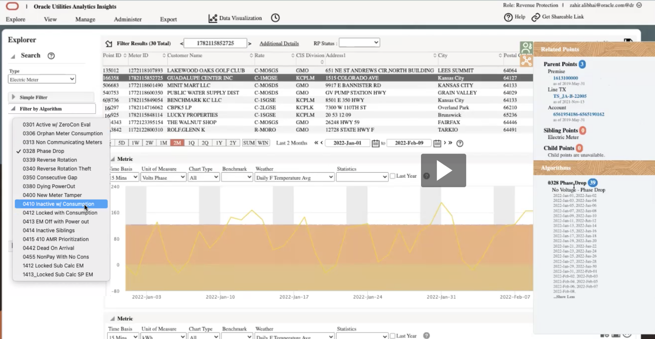
Based on workshops with the customer service delivery team I was able to draw out their current experience. There are two different scripts, one for the analyst - the primary user, and the other is the supervisor - the secondary user. This really helps me learn their pain points when it comes to using the current application (see below for an image of the legacy screen).
Alex, Analyst, Current Script (Primary User)
Shivan, Supervisor, Current Script (Secondary User)
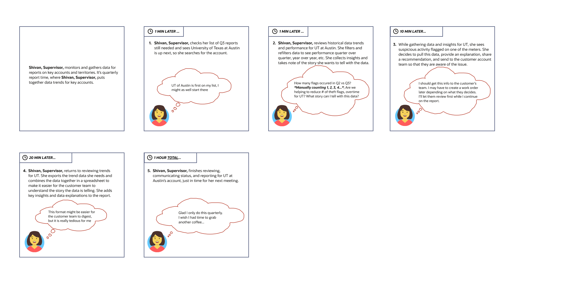
Step 2 – Future Scripts
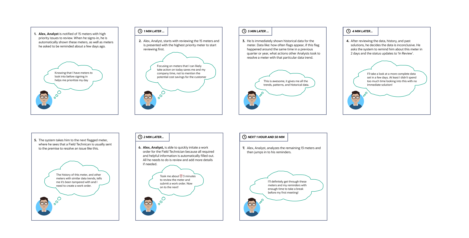
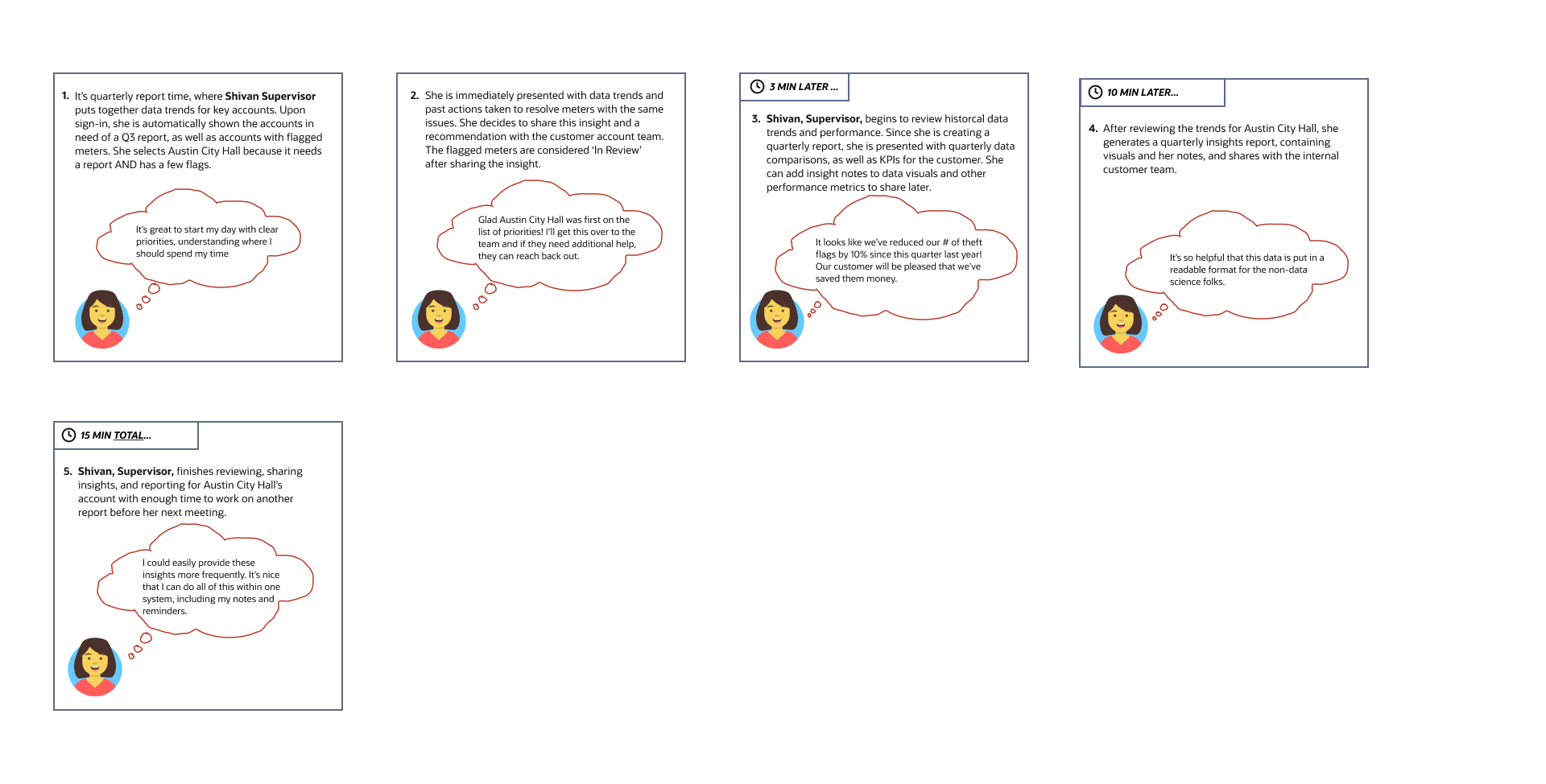
There are also 2 future scripts one for each user. They include some things that significantly improve the user’s experience from prioritization of problems to automatically surfacing relevant data to providing recommended solutions.
Alex, Analyst, Future Script (Primary User)
Shivan, Supervisor, Current Script (Secondary User)
Wireframing 🚧
Step 1 – Review Old Application
One of the customer service delivery employees walked us through the current platform. He should us how the user navigates and looks for problems. Some of the pain points mentioned:
There are too many filtering options, the analyst doesn’t know what to focus on
After selecting a meter from the list, they need to scroll to see the other charts and it is very difficult to keep track of which one they are troubleshooting
It is difficult to identify some of the problems so many times the user has to share the information found here with the rest of the team or look at other applications to get more clarity.
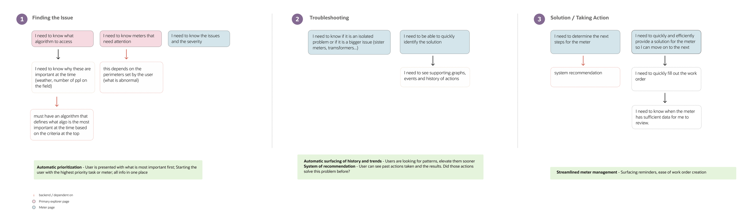
Step 2 – User flow
Tool: Figma
Creating a user flow really helped me understand what needs to happen at each step and how we can improve it. I was able to review this with the customer service delivery team and get their feedback on it. This really helped guide the wireframes and the hi-fidelity designs.
Step 3 – Wires
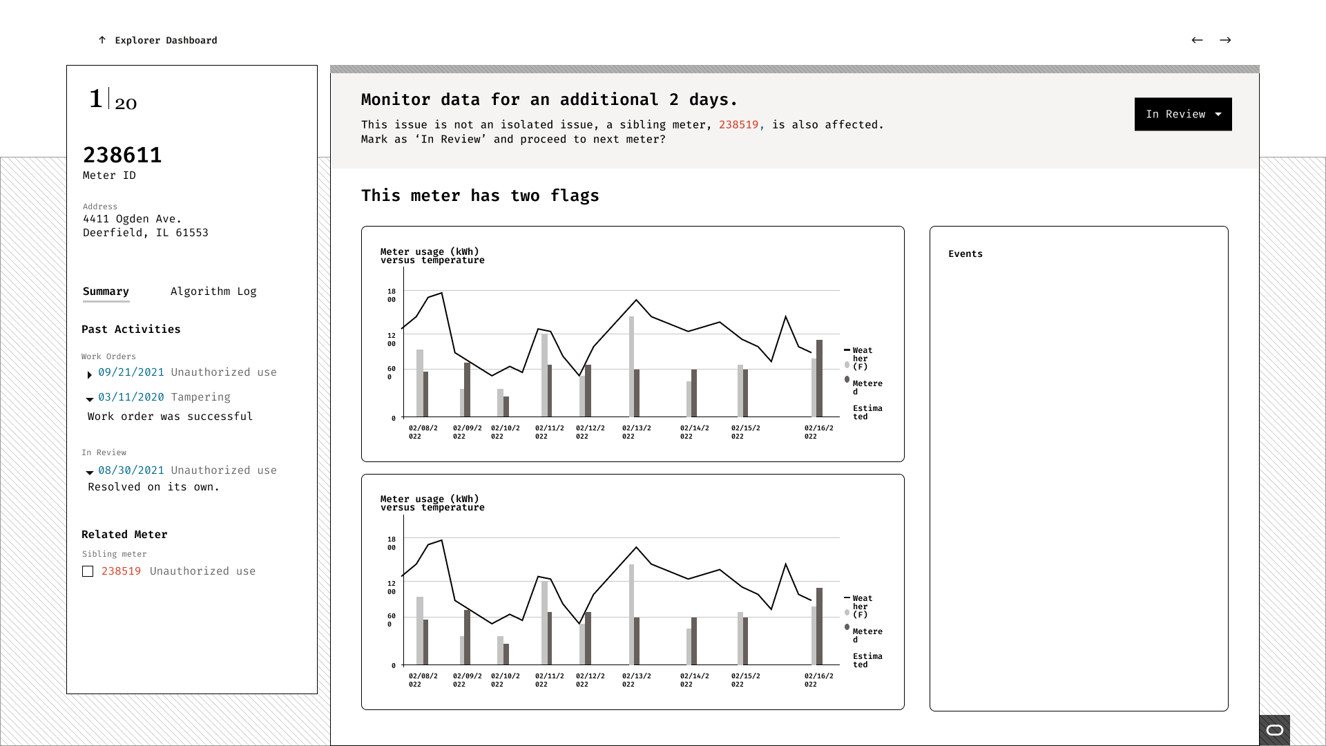
For the wires, I experimented with different placements and layouts trying to figure out what is the crucial information that the user needs to see on each screen, and what is causing confusion or cognitive overload. I chose the first screen shown below.
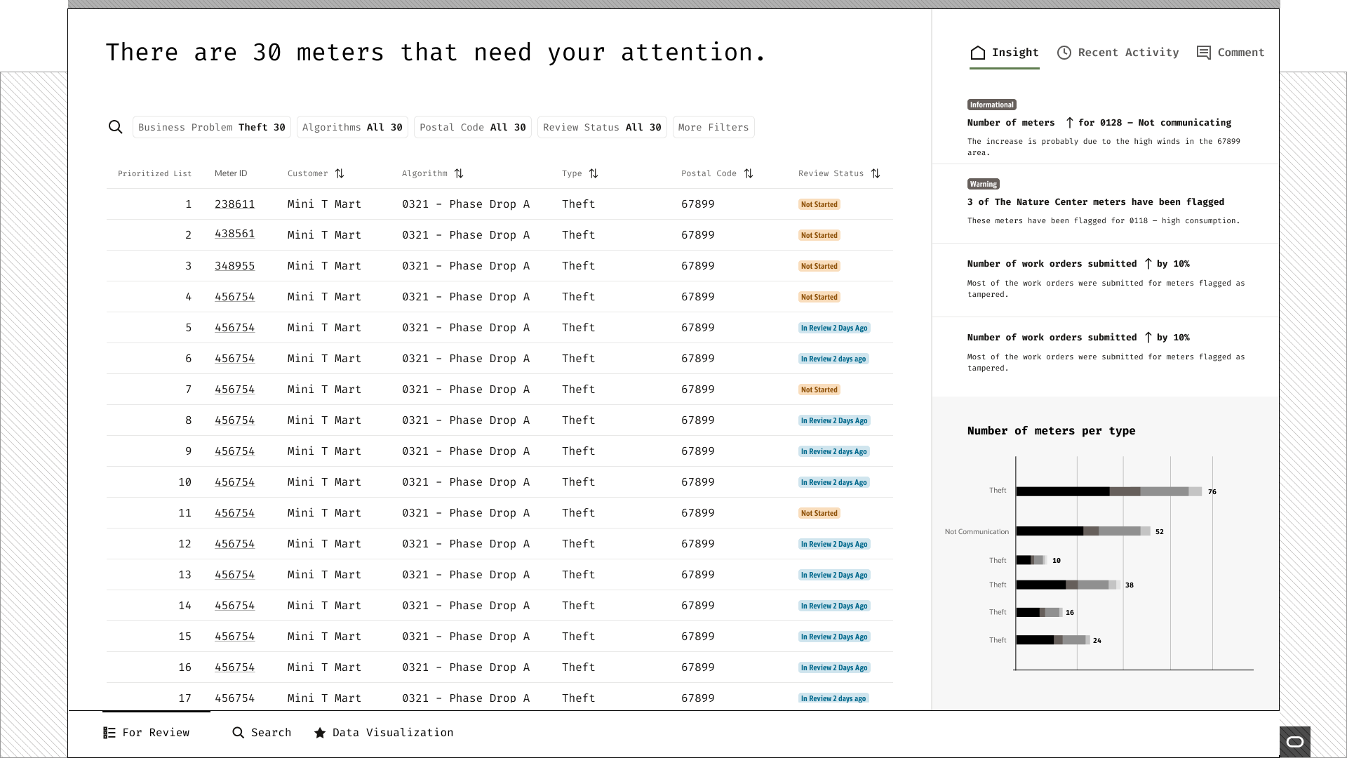
(Final Wire) This main dashboard page allows the user to filter by different categories. It is a smart filter so it will adjust based on the filters chosen. It also gives them a summary of items that need their attention. They are able to see the status of these meters and the issues. There are also issues, recent activities/actions that analysts perform within the platform, and a comment feature for direct commenting capability within the application.
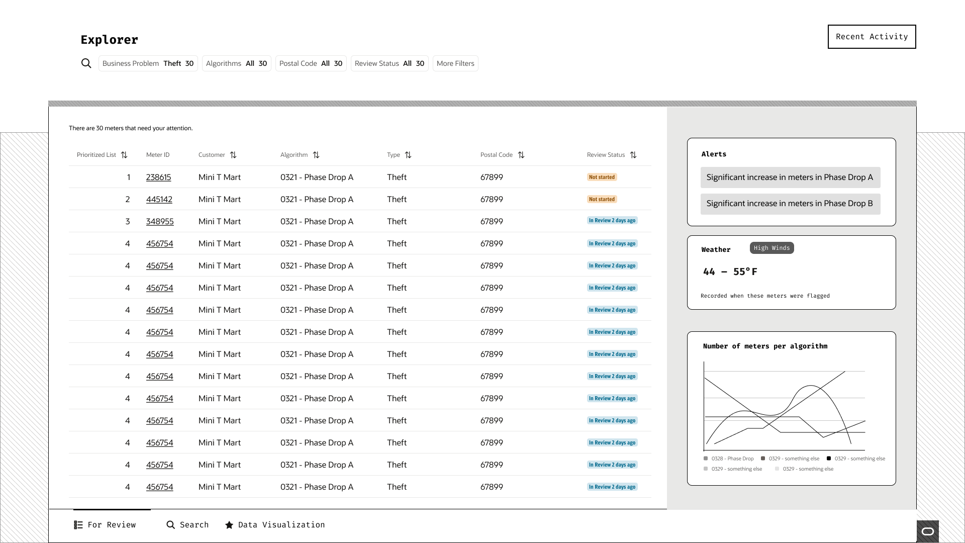
(2nd Version) This was an iteration where the right panel had different categories that gave the user data. The only issue with this is that it would require the user to look at the data and deduce what is happening. It would definitely be better to relay the data as insight hence the final design.
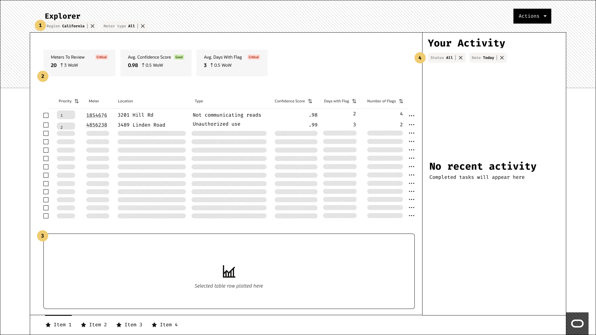
(First Version) Rough layout
Meter diagnosis and troubleshooting page – the user can see the information about the meter at the same as the charts and also receive a recommendation which should speed up the process of resolving the issue and also instill confidence in the user when taking action.
Hi-Fidelity Design 🖥
Tools: Figma
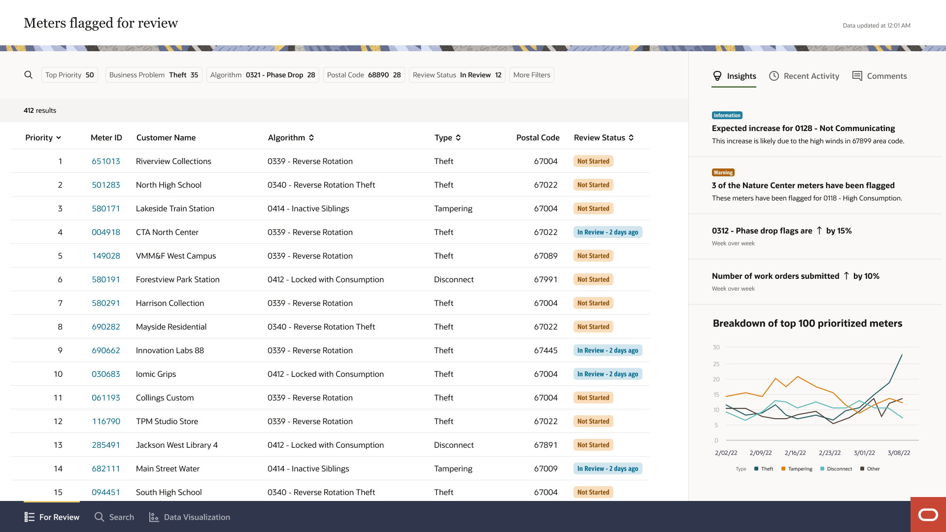
Main Dashboard page. Gives the analyst a default view of the meters that need their attention. It also allows them to filter the list down so they focus on a specific business problem or an algorithm. This page only shows what the user really needs to know. The panel on the right has supplemental information that will give the user an overview of what is going on in the network (translating data into useful insights). It also has a recent activity tab that shows the actions taken on the application. The last tab is a comments one, which shows all comments within the application.
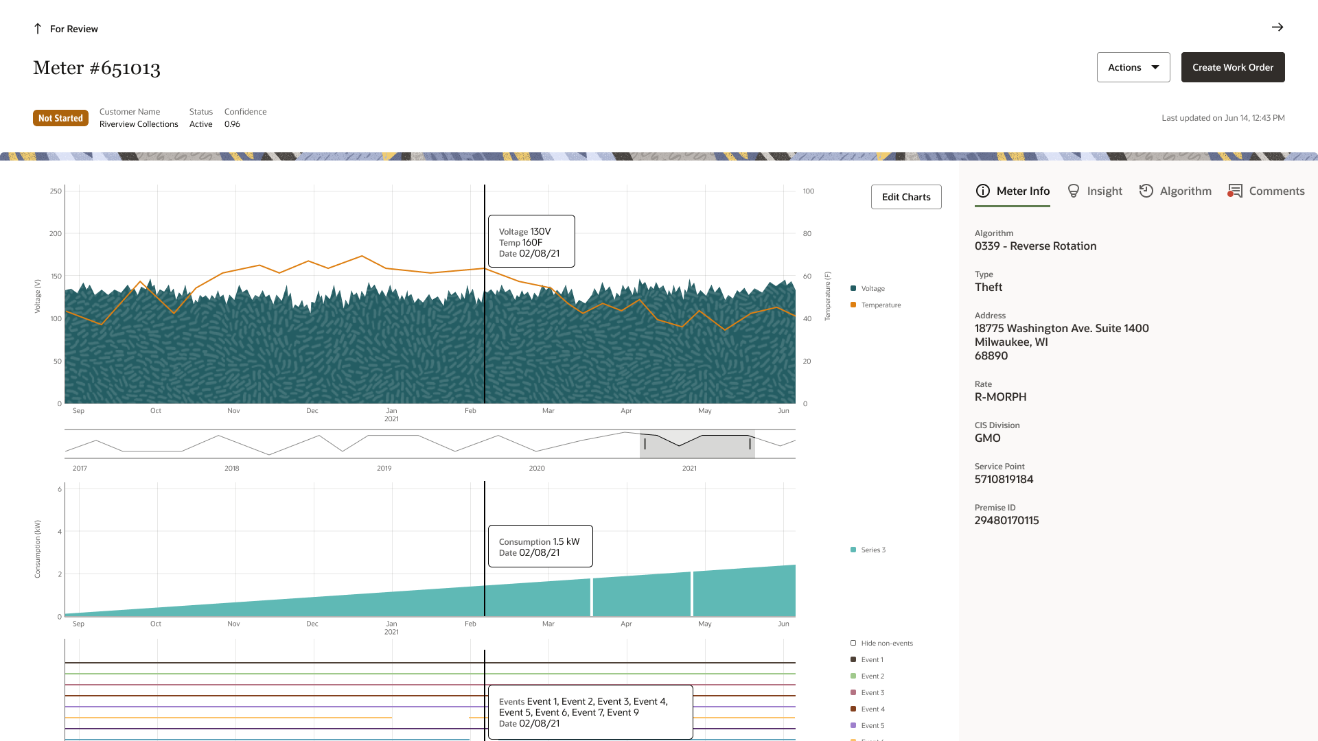
Meter Insight page – This page gives the user an overview of what is going on with the meter. It shows graphs that are relevant to the issue. The button in the top right defaults to the recommended action (so it can be a work order or place in review for example). The tabs to the right give the user different relevant information.
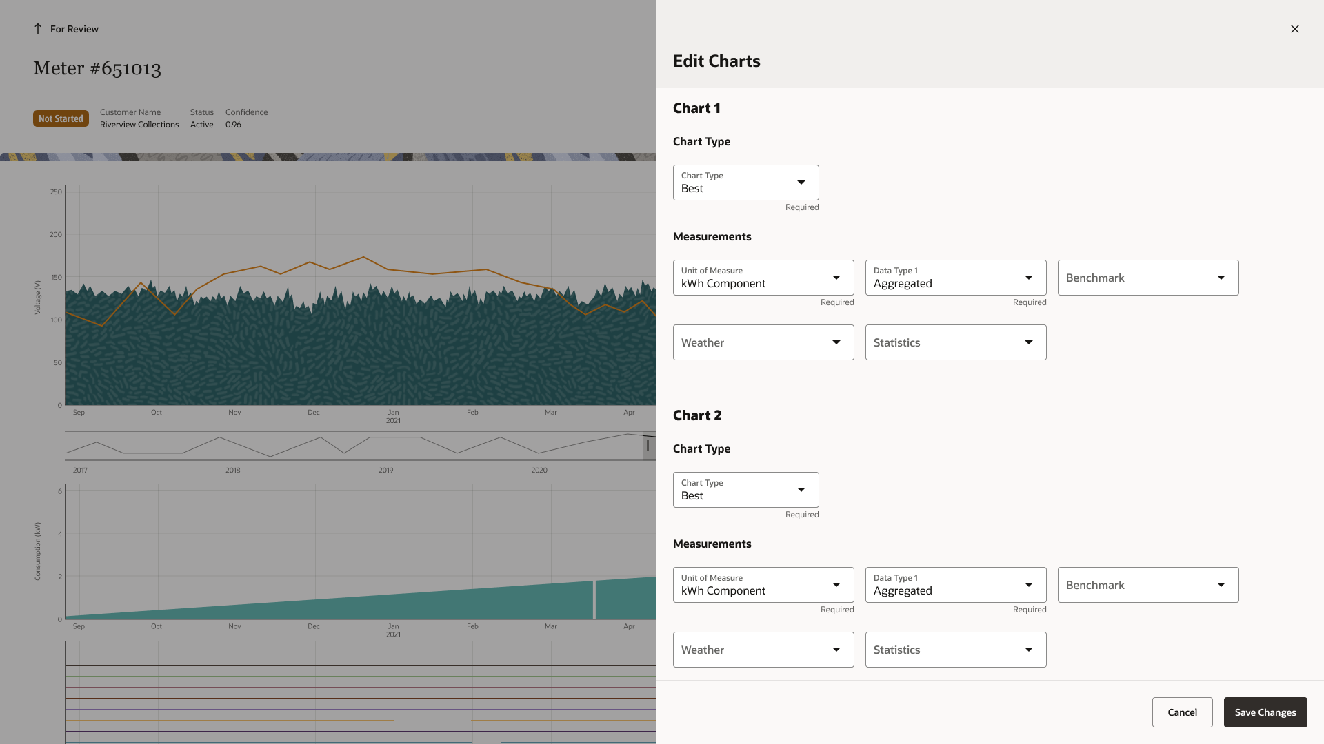
The user is able to change the data type on the graphs if they would like but this is rare.
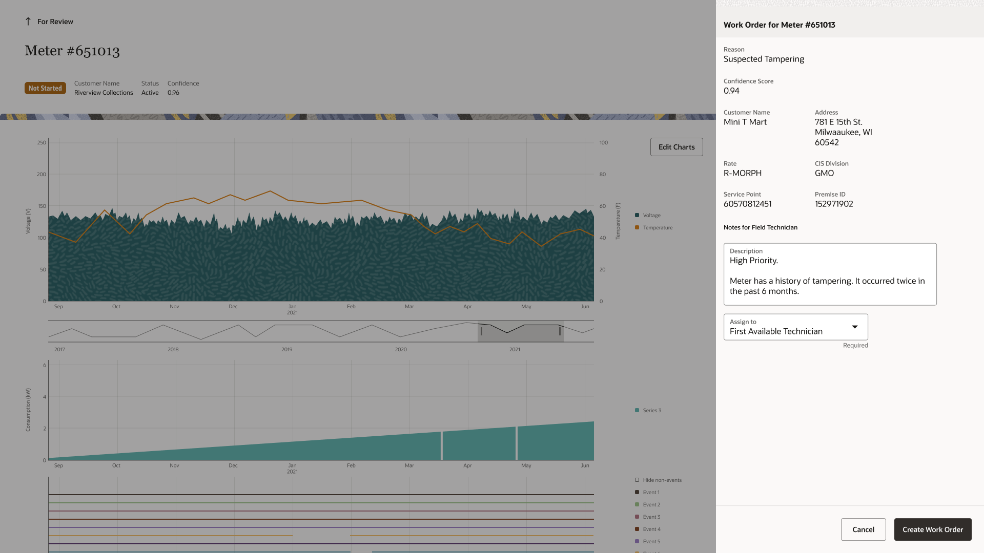
Submitting work orders in the legacy version was done on a separate application. In this newer version, it can be done within the application. Most fields would be auto-populated for the field engineer. There is space for notes.
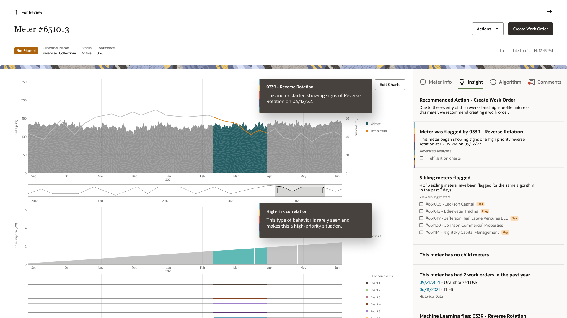
If the user toggles to the insight tab they can click on a specific insight to view it on the page as seen above. If the insight is on the graph then it will highlight the area and add a description of the time and issue that occurred. One of the insights will be the recommended action.
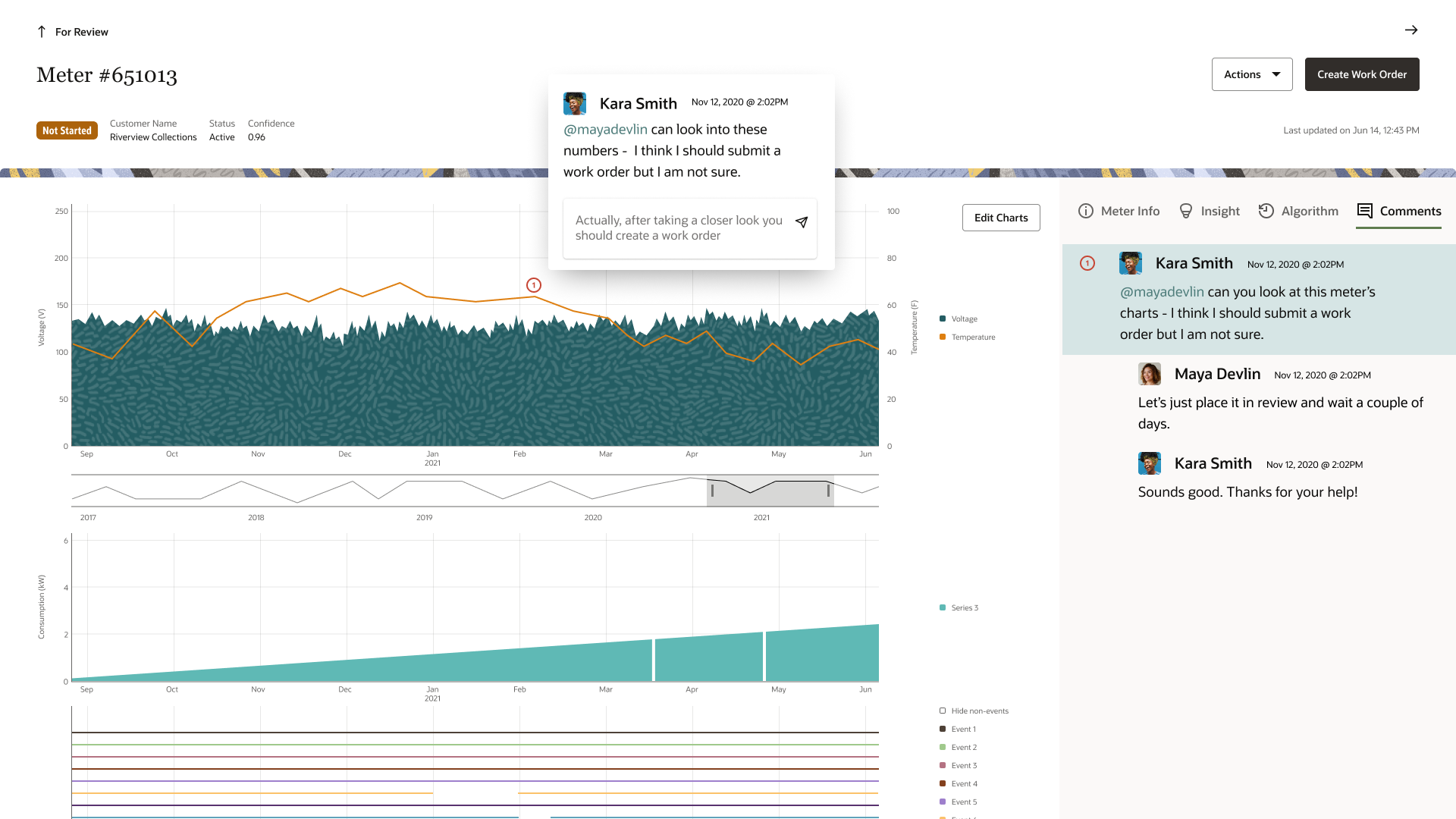
The user can toggle to the comments and add or respond to comments there. This helps keep all the discussions on the application so different users can see the history of the meter and any relevant comments.
Takeaways 📝
Working on this project was definitely rewarding as the product owner and customer delivery service team were very excited about the new version of the application. I learned a lot through this process. One of my key takeaways is definitely the importance of telling a story through data. I was also able to work with the engineers to provide detailed specs for the designs that would help them implement them. I also connected the lead engineer to a developers team that has these layouts already coded so the engineering team could just use them.
Overall, this project was really interesting and I was able to learn a lot about electric and water meters. Throughout this project, I made sure that we were in close contact with the product owner, the customer delivery service team, and engineering so that we can get instant feedback and ensure that we are aligned.